How to Choose Paint Colors for Your Home (Without Making Expensive Mistakes)
Choosing paint colors is one of the most exciting parts of decorating — and one of the most nerve-wracking. A can of paint costs $30–$60. But multiply that by the gallons needed to cover a living room, add the time spent taping and rolling two coats, and a poor color choice can cost you several hundred dollars and a very frustrating weekend. No wonder so many people play it safe with "off-white and hope for the best."
The good news? Choosing paint colors confidently is a learnable skill, not a mysterious gift. Once you understand a handful of principles — undertones, ratios, and how light behaves — you can walk into any room and know exactly what it needs.
Start Here: Understanding Undertones
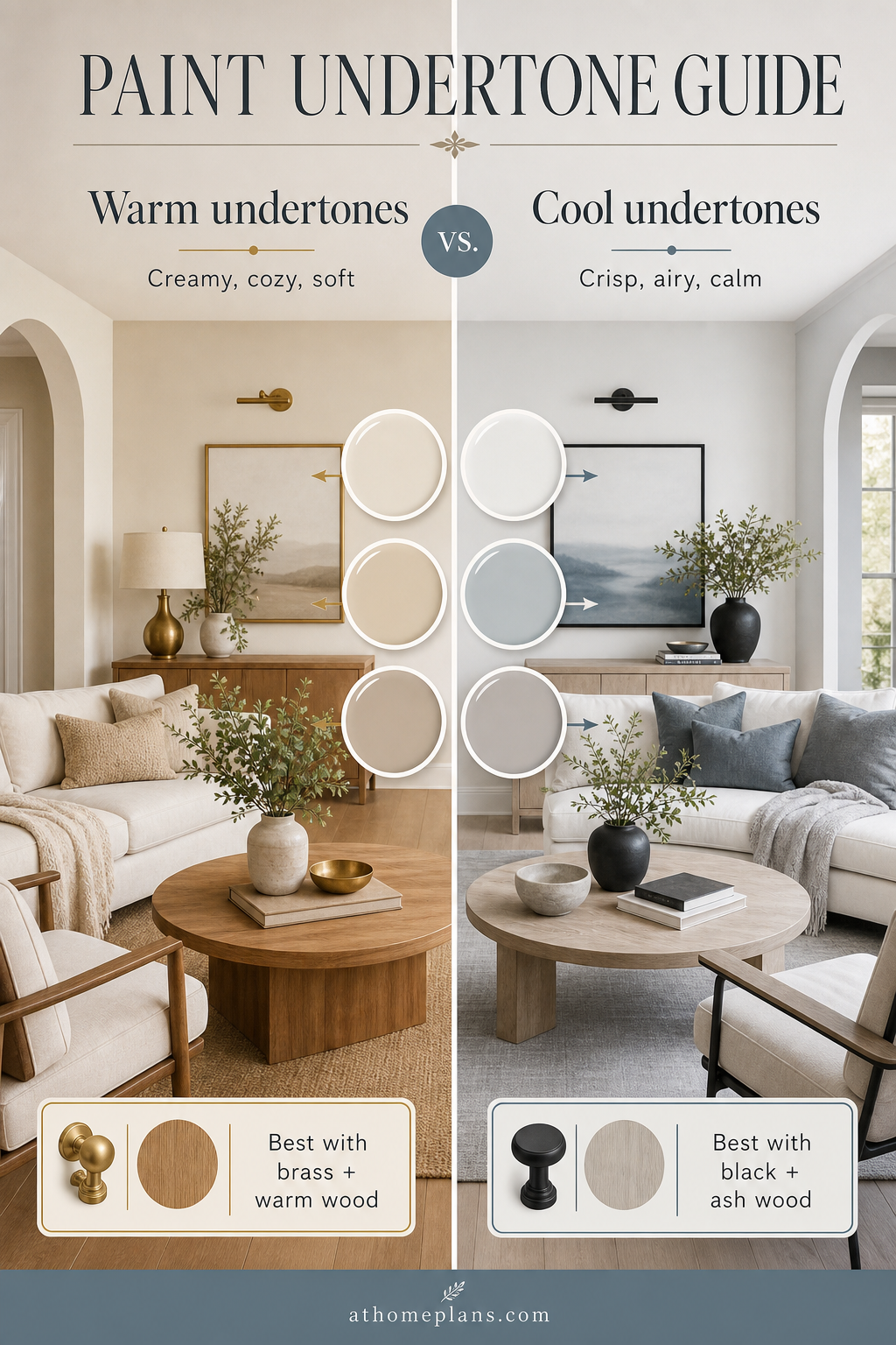
The single biggest source of expensive paint mistakes is ignoring undertones. A paint labeled "warm white" and another labeled "cool white" can look almost identical on a chip card but clash violently once they're on your walls, trim, and ceiling together.
Every paint color has an undertone — a secondary hue that surfaces depending on the light in your room. Whites can lean pink, yellow, green, or blue. Grays can read purple, green, or brown. Even a simple "greige" can tip warmly beige in bright light and coldly lilac on an overcast afternoon.
How to spot undertones:
- Hold the paint chip against a pure white sheet of paper. The secondary color will reveal itself.
- Compare two "similar" shades side by side on the same wall — the difference becomes obvious.
- Consider your fixed finishes: flooring, baseboards, window frames. Cool gray floors will fight a warm yellow-toned paint; they'll complement a blue-leaning one.
As a rule: warm undertones (yellow, red, orange) suit south- and west-facing rooms that already get warm sunlight. Cool undertones (blue, green, gray) work well in north- and east-facing rooms, where they add crispness rather than chill.
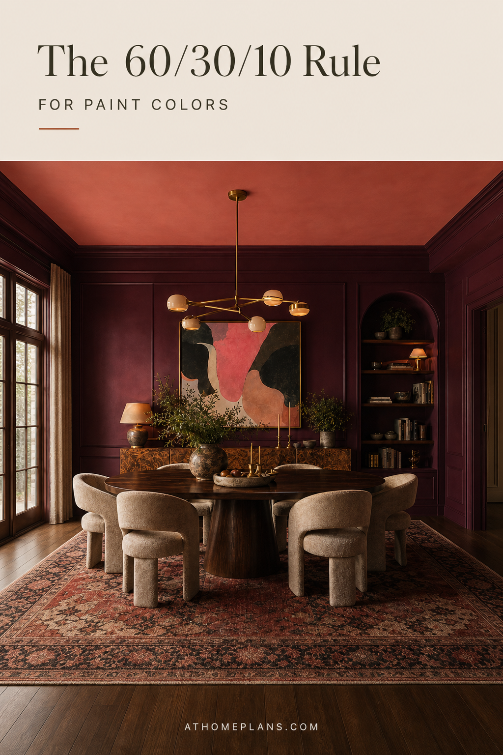
The 60-30-10 Rule: Your Color Proportion Formula
Professional interior designers use a simple ratio to stop rooms from feeling chaotic or flat: 60% dominant, 30% secondary, 10% accent.
- 60% is your main wall color — the backdrop that sets the mood.
- 30% is your secondary color, usually brought in through upholstery, curtains, or a large piece of furniture.
- 10% is your accent — pillows, artwork, a painted alcove, accessories.
This ratio works because it gives the eye somewhere to rest (the dominant field) and somewhere to travel (the accent). It also means your bold choices — a deep teal or a burnt terracotta — belong in the 10% or 30% bracket, where they create impact without overwhelming.
When you're choosing your wall color, always have your 30% and 10% in mind. Soft sage green walls work effortlessly when your sofa is natural linen (30%) and your pillows and artwork bring in warm rust (10%). Pull those elements first, then choose your wall paint to anchor them.
Sample Pots: How to Use Them Properly
Most people do this wrong. They buy a sample pot, paint a small square on the wall, let it dry, and decide. This is how you end up repainting a room twice.
Do this instead:
- Paint two large patches on different walls — one that gets direct sunlight, one in shadow. The same color can look completely different depending on which wall it's on.
- Paint on white cardstock or poster board rather than directly on the wall. This lets you move the swatch around the room and hold it next to furniture, floor, and curtains. Brands like Sherwin-Williams and Benjamin Moore offer peel-and-stick sample cards and sample pots for this.
- Check it at different times of day. Morning light, midday, and evening lamplight will all shift the color. Live with the swatch for 48 hours before committing.
- Paint a second coat. One thin coat of sample looks nothing like two full coats of the actual paint.
Sample pots from Sherwin-Williams and Benjamin Moore are widely available online and in-store — and give you enough paint for a tabloid-sized swatch, the minimum you need for an accurate read.
Room-by-Room Color Guidance
Living Room
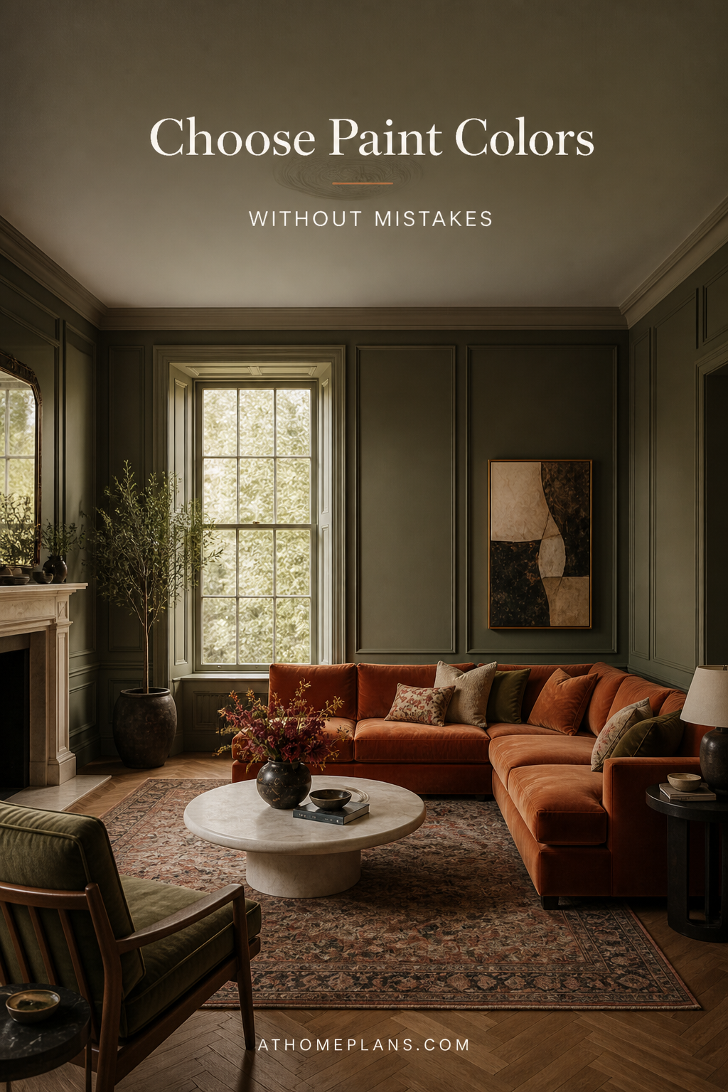
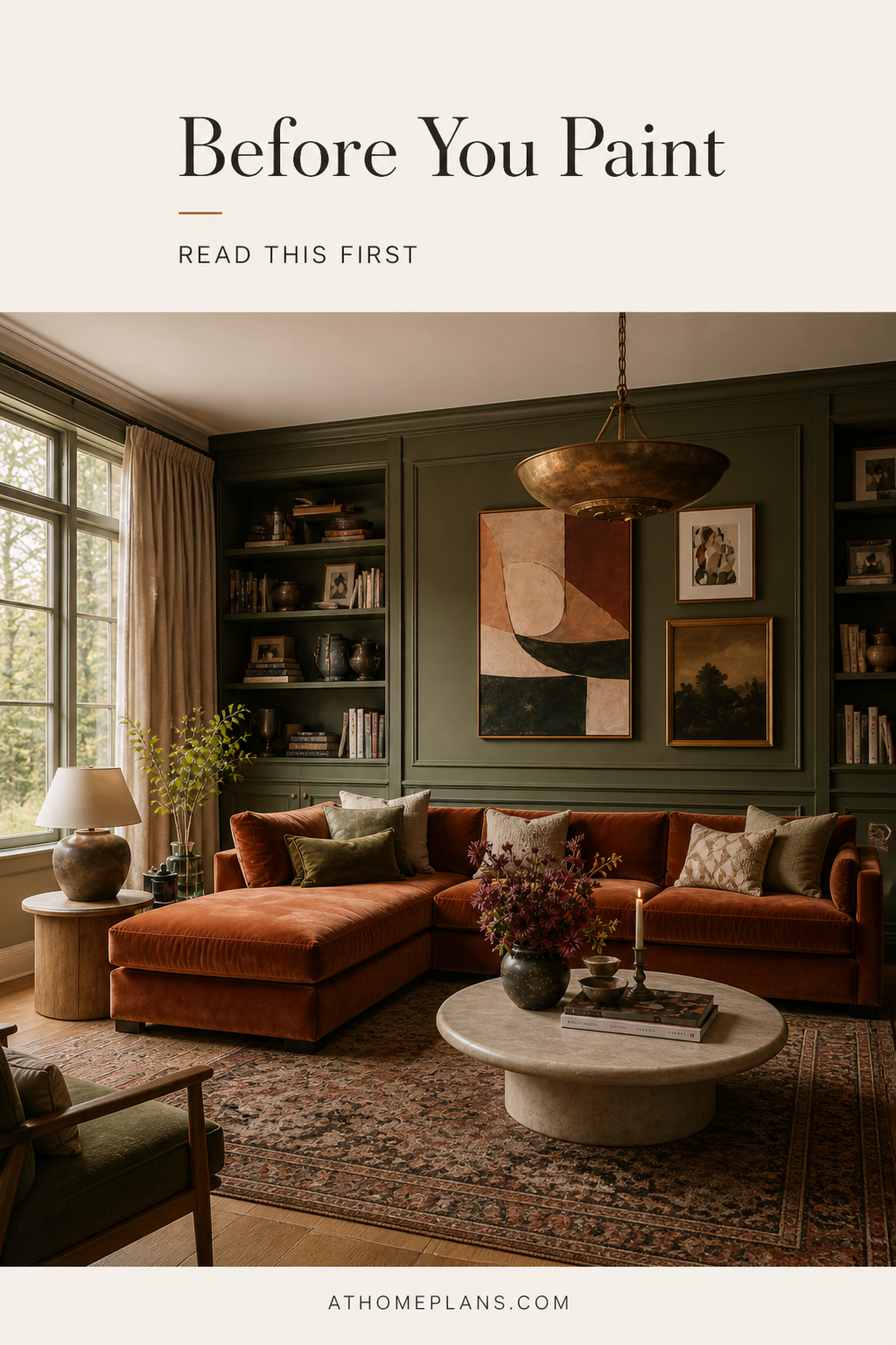
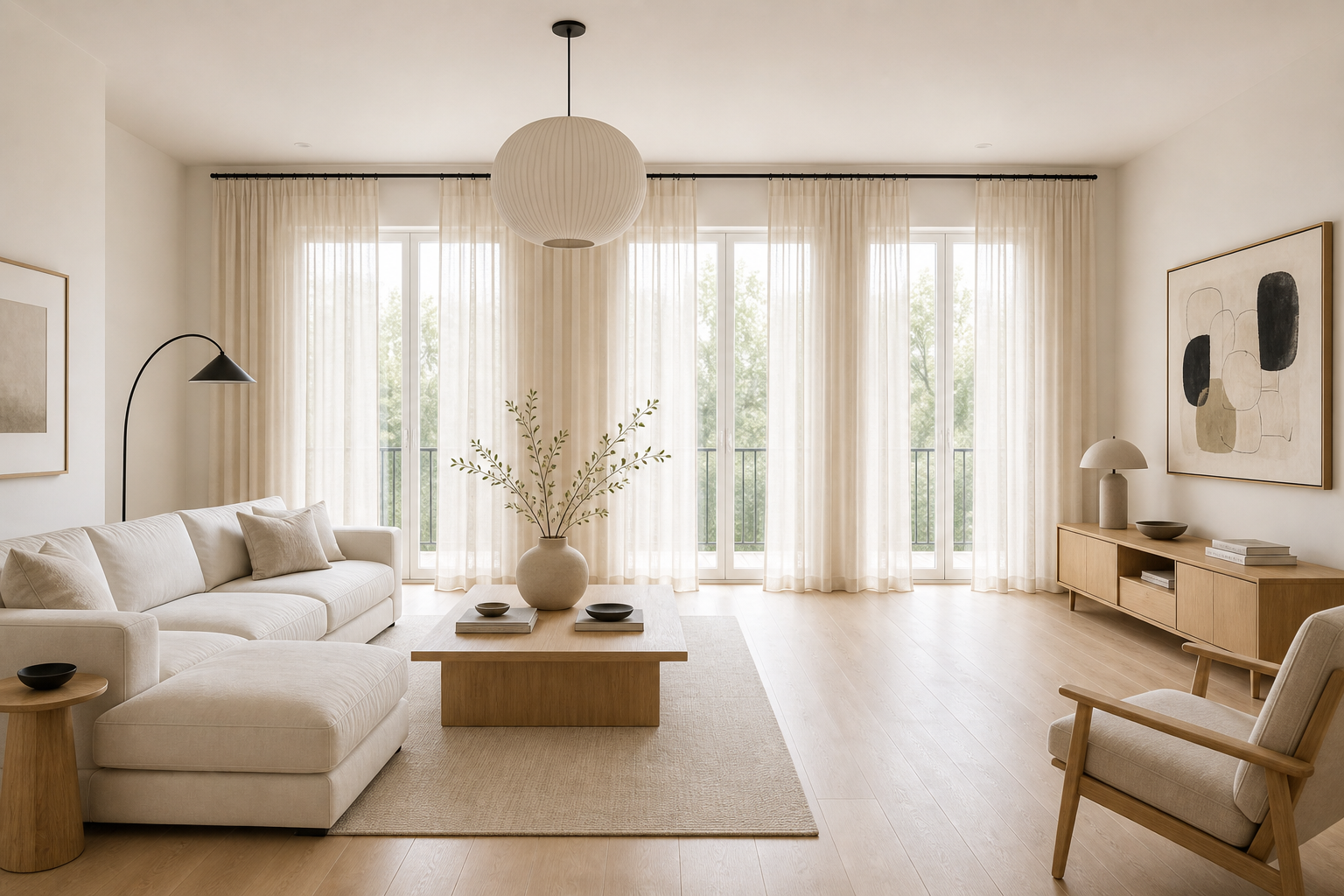
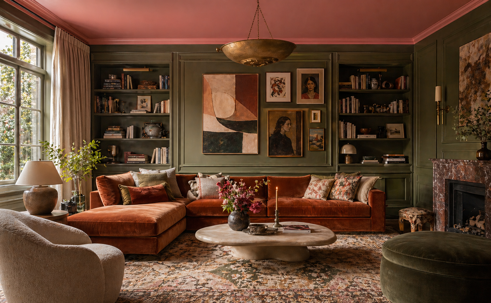
Your living room is where undertones really earn their keep. Most living rooms face multiple directions and are used in natural and artificial light. Warm neutrals — putty, warm linen, soft terracotta — are forgiving across different lighting conditions. If you want drama, consider a single feature wall or alcoves in a deeper shade of the same color family; this adds depth without commitment. Avoid very cool blues and greens unless you have south-facing windows and strong natural light.
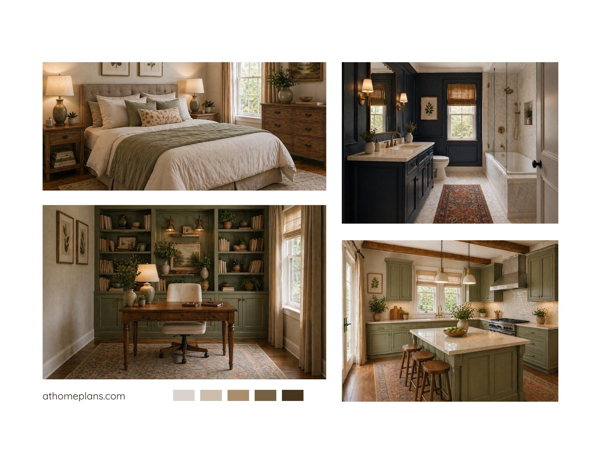
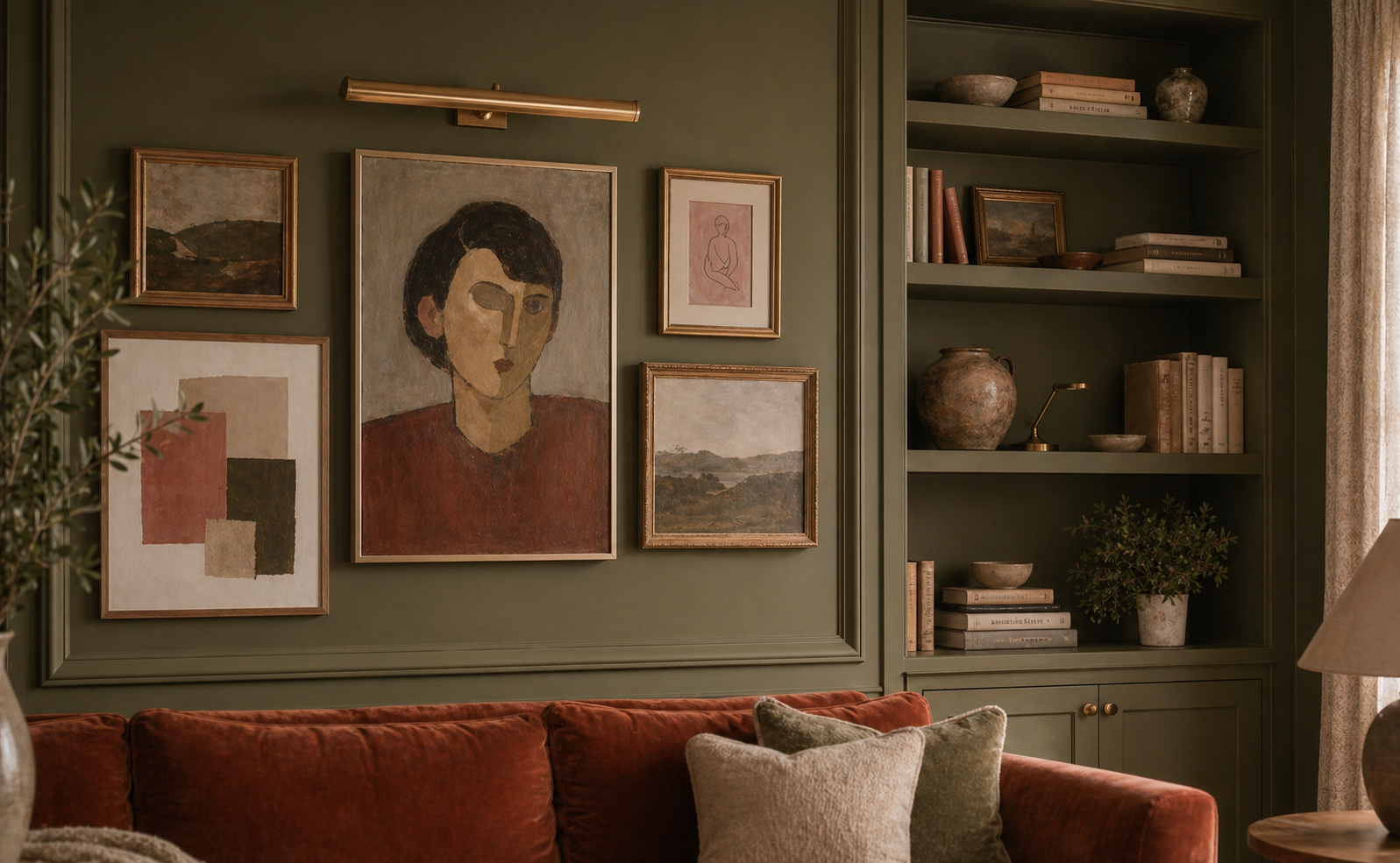
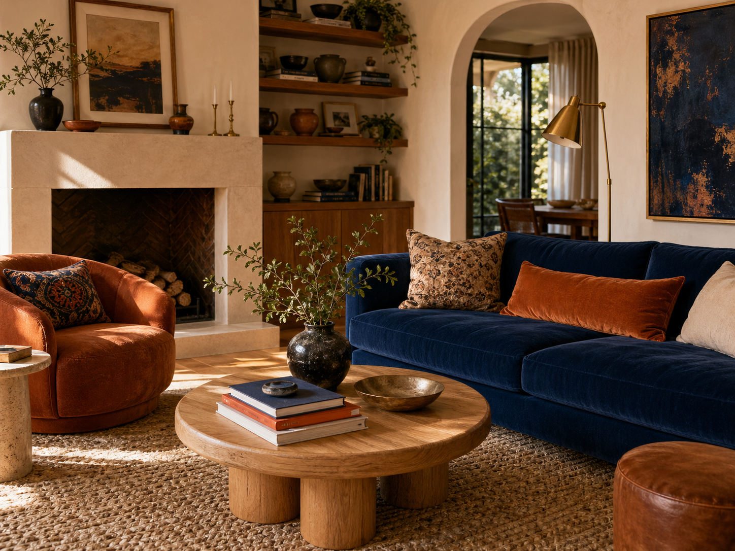
For a bolder look: try full color drenching — walls, ceiling, and built-ins in the same deep hue. Our Organic Modern Living Room (Palette 1) uses Pewter Green SW 6208 across every surface except the trim, creating an enveloping, gallery-like effect that photographs as a single confident statement rather than a collection of furniture.
Bedroom
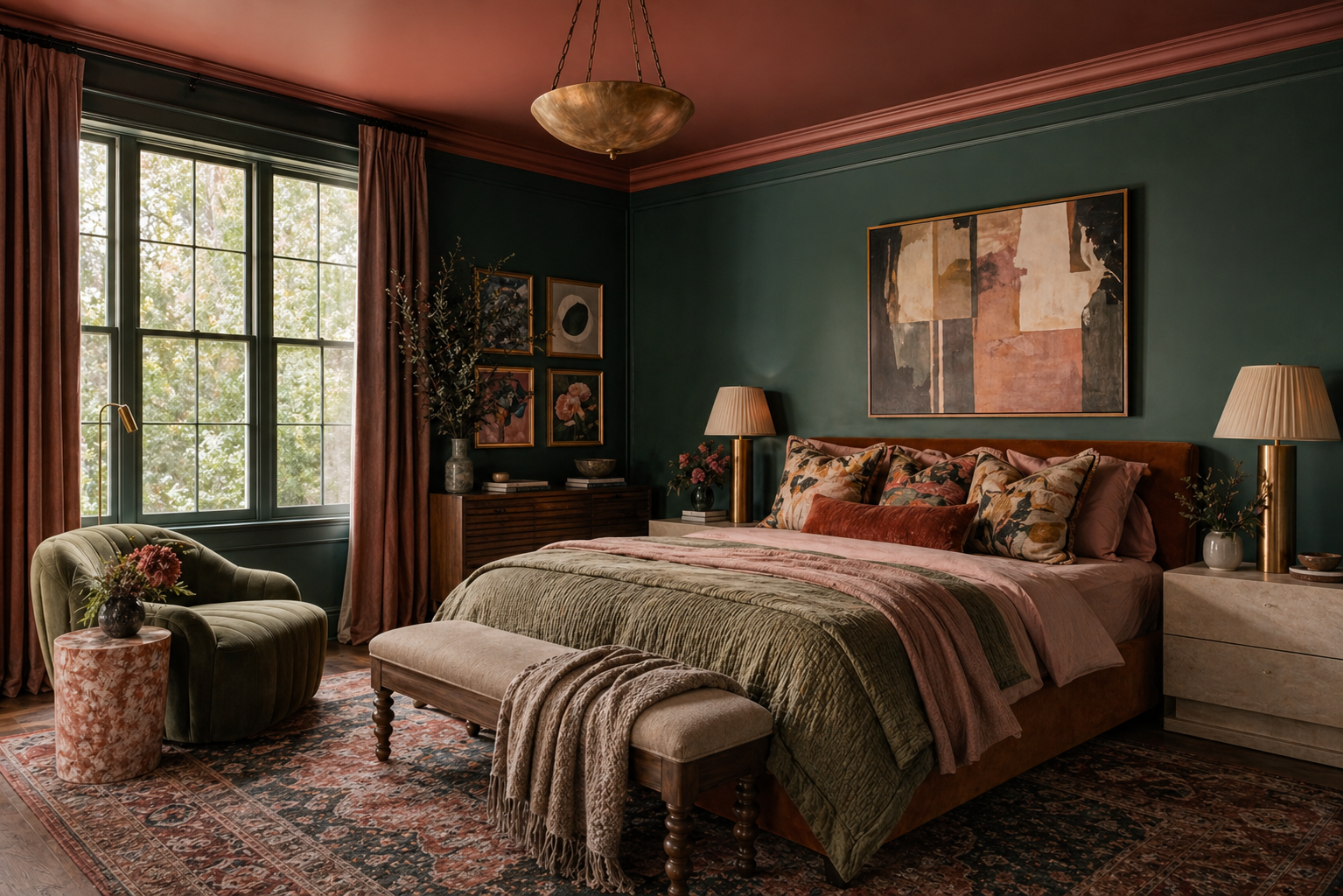
The bedroom should feel restful, so reach for colors with low saturation — soft sage, muted lavender, chalky blush, warm stone. These aren't "boring"; they're deliberate. High-saturation colors (bright yellow, vivid teal) are stimulating, which is the last thing you want at 11pm. Keep your 10% accent energetic if you want personality — a bold headboard wall in deep forest green, for example, with soft warm walls on the remaining three sides.
For a bolder look: a complex sage-green like Pewter Green SW 6208 reads calmer than it sounds on a chip — it has enough gray in its undertone to feel sophisticated rather than loud. Pair with Natural Linen on upholstery and trim (30%) and Marooned SW 6320 in cushions and art (10%) to stop it reading flat. See Palette 2 for the full execution.
Kitchen
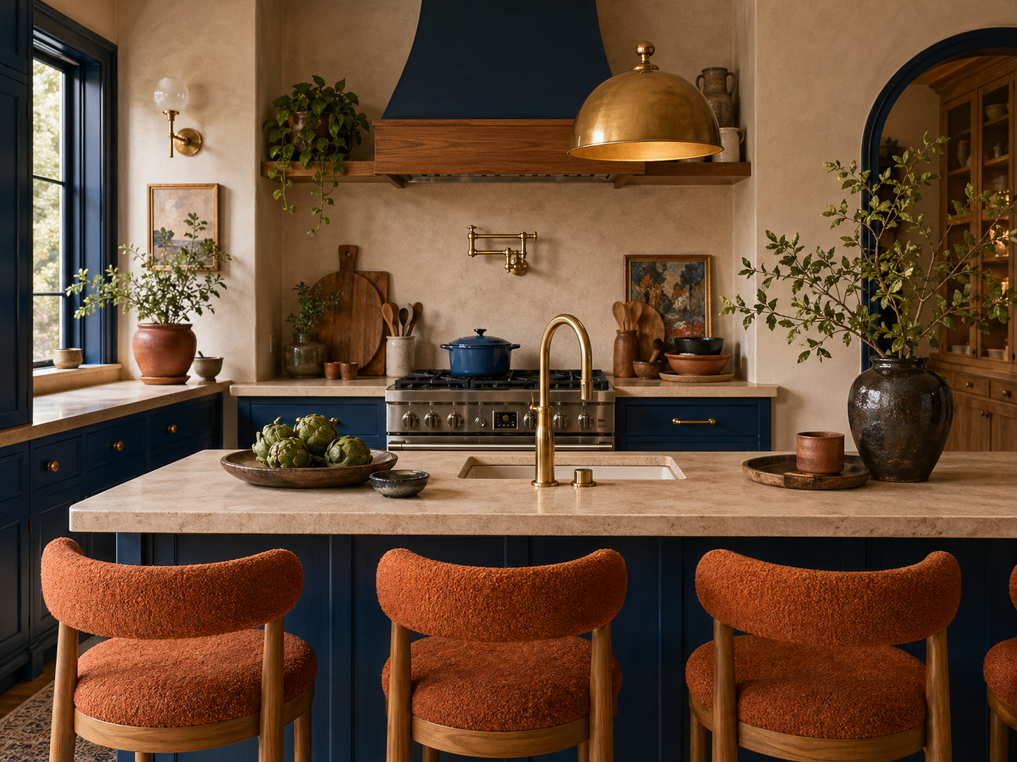
Kitchens benefit from either very neutral tones (which let the cabinets and countertops do the work) or characterful, saturated choices that commit fully — deep navy, inky green, or brick red all look considered rather than chaotic. Avoid mid-range, dusty colors; they can look dirty in a space associated with food. Finish matters here too: eggshell or semi-gloss is far more practical than flat paint, which marks and is hard to wipe down.
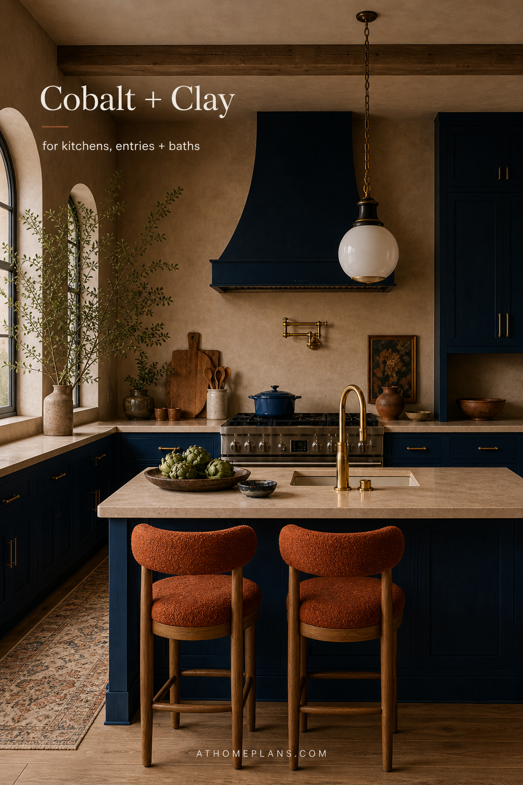
For a bolder look: the kitchen is one of the best rooms to try color drenching precisely because it has so many hard surfaces. Naval SW 6244 on walls, ceiling, and upper cabinets, with a contrasting Cavern Clay SW 7701 island, creates a high-contrast palette that feels considered rather than chaotic. The key is committing — half measures in bold kitchens always look unfinished. See Palette 5.
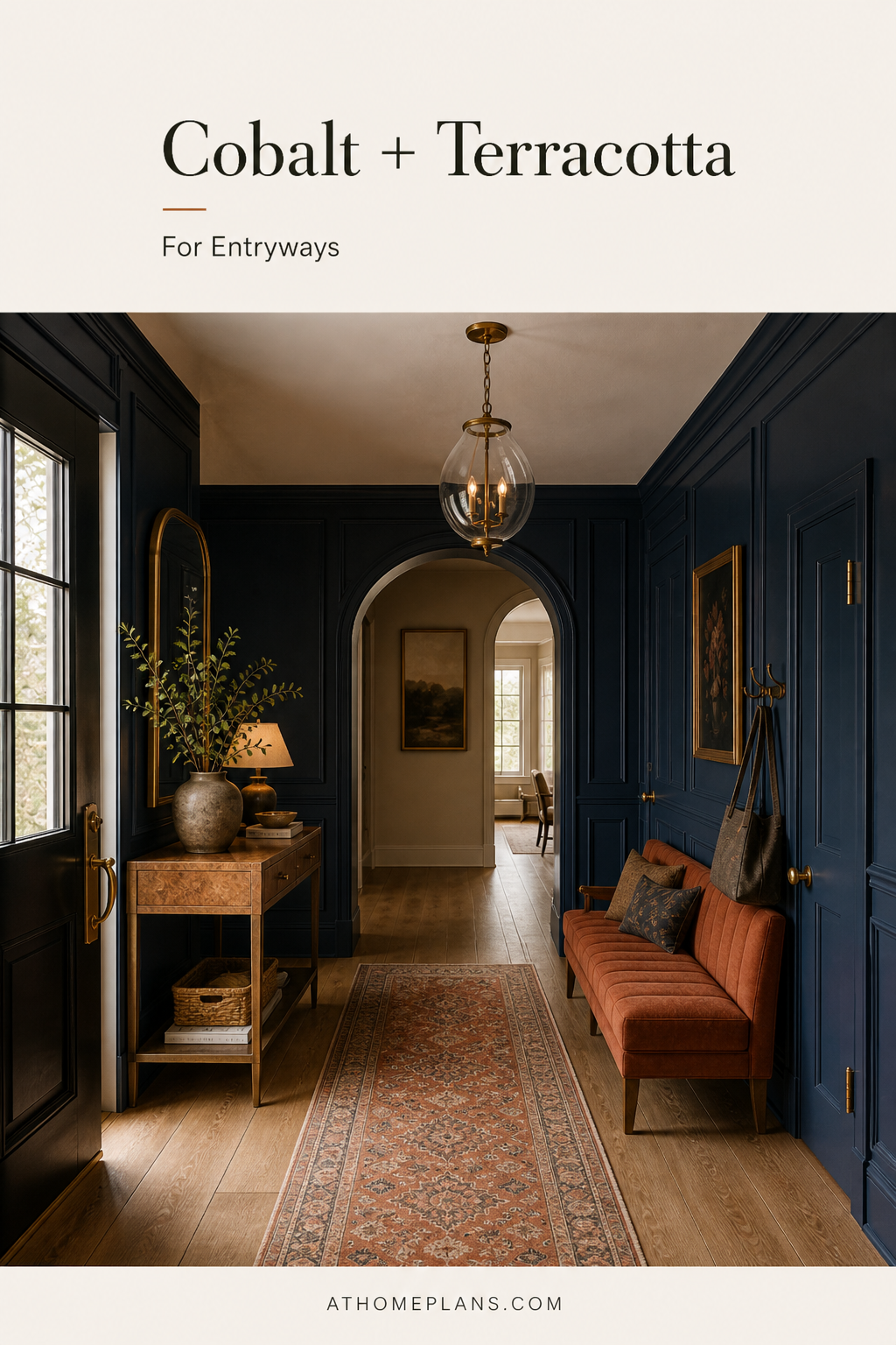
Hallway
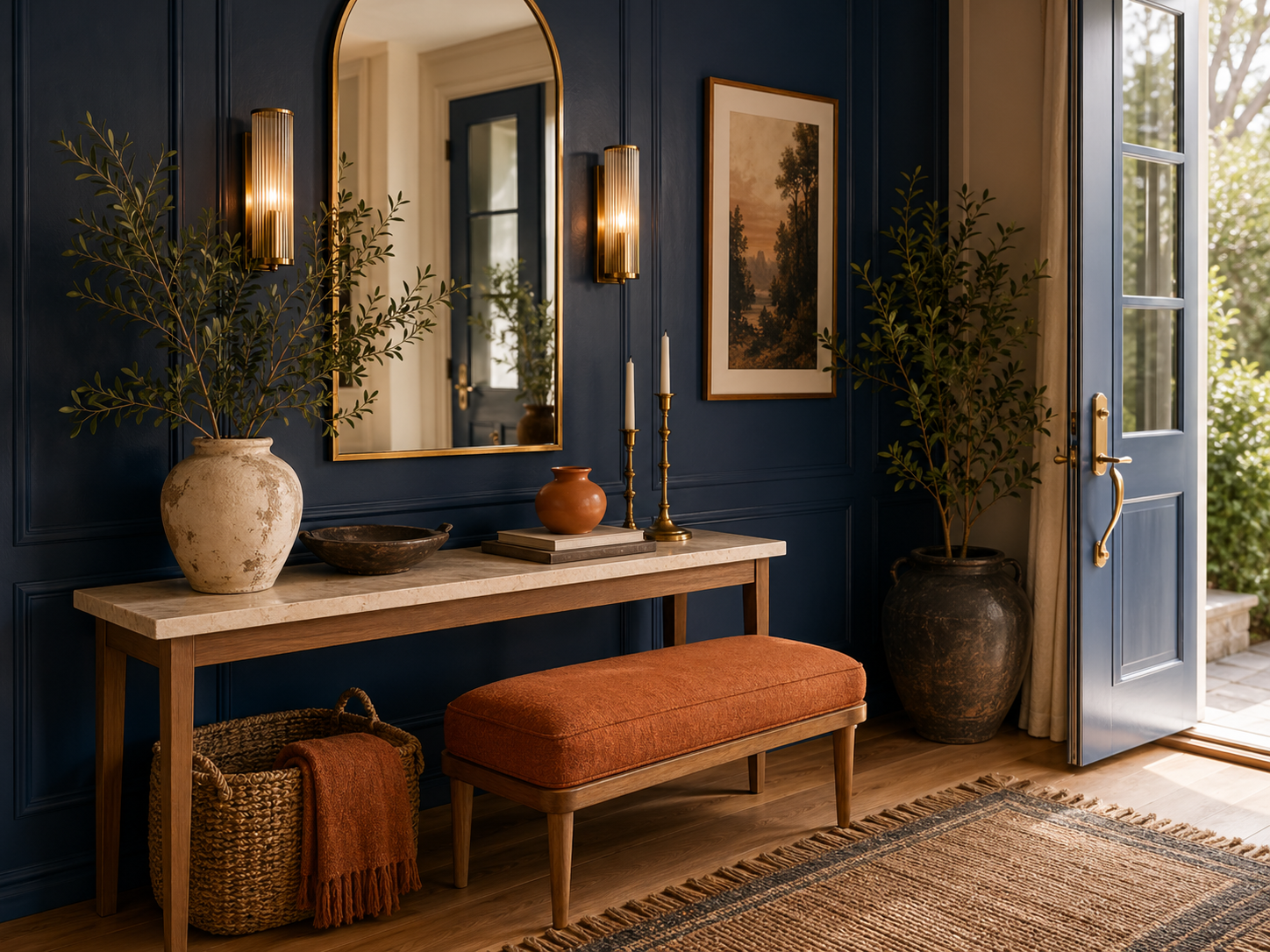
Your hallway is a transitional space, but it also sets the tone for the whole house. Don't default to beige out of caution. A hallway in a bold, enveloping color — deep navy, forest green, warm terracotta — looks deliberate and confident. Because hallways are often narrow with limited natural light, dark colors can actually make them feel more dramatic and intentional rather than cramped. Use a higher sheen (eggshell rather than flat matte) to bounce what light there is.
For a bolder look: the hallway is the best room in the house for a maximalist experiment. It's a transitional space — people move through it, not live in it — so even an extremely saturated color choice feels exciting rather than exhausting. Consider running the same bold color from floor to ceiling, trim included, for a fully immersive first impression.
Behind the Bold: Our Paint Selections Explained
The visuals in this post don't use the kind of paint colors most people reach for. They're deliberate. Every palette was chosen to demonstrate a specific design principle — and to show that bold choices, when they're committed and considered, look far better than cautious ones.
Here's the thinking behind each color story.
The Organic Modern Living Room (Pewter Green SW 6208) — We chose Pewter Green because it sits in an unusual sweet spot: it reads green in daylight, almost olive in lamplight, and always warm. It avoids the cold, clinical quality that trips up many green rooms. Paired with Natural Linen SW 9109 on upholstery and trim, it creates an interior that feels grown, not decorated.
The Restful Bedroom (Pewter Green SW 6208 + Marooned SW 6320) — The same Pewter Green base reads completely differently in a bedroom context — quieter, more considered. The Marooned accent (deep burgundy-brown) gives it warmth and depth without the room tipping stimulating. Natural Linen keeps everything from going heavy.
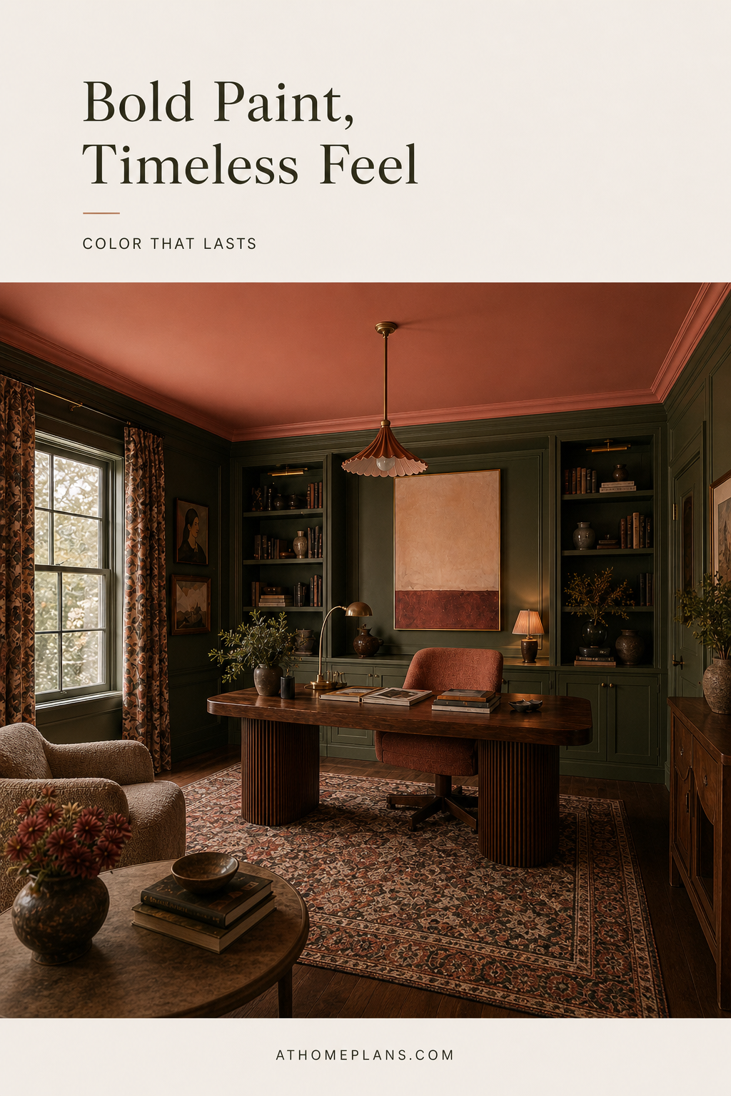
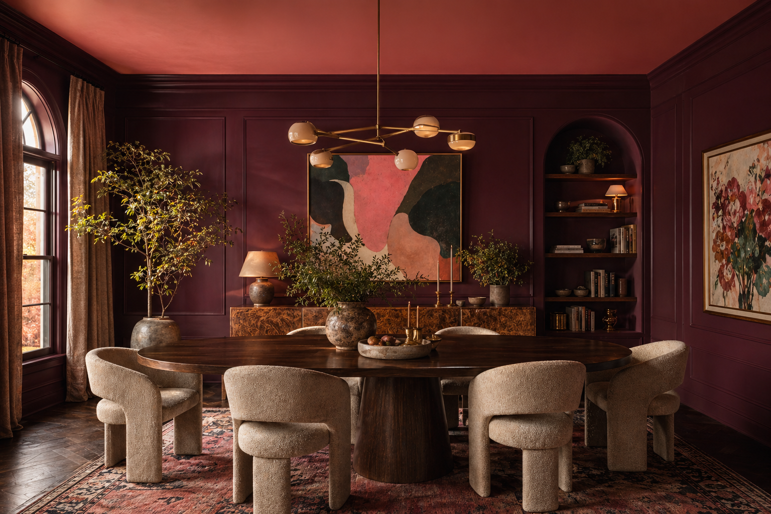
The Bold Dining Room (Marooned SW 6320 + Coral Clay SW 9005) — This is full commitment to richness. Marooned is deep and saturated but has enough warm brown in it to read luxurious rather than aggressive. Coral Clay on accents prevents the room going monotone. Natural Linen on the trim keeps it breathing.
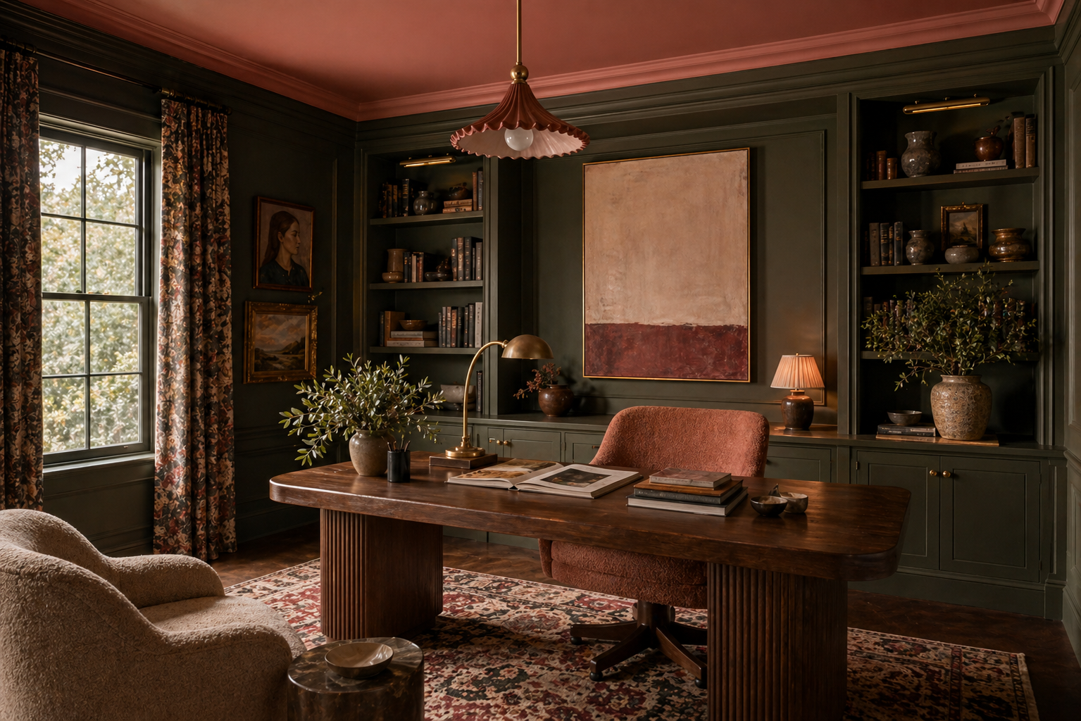
The Focused Office (Pewter Green SW 6208) — Pewter Green is a sage with enough gray to disappear into a working background — which is exactly what an office color should do. It's not neutral and it's not loud. It creates an environment that feels considered without demanding attention.
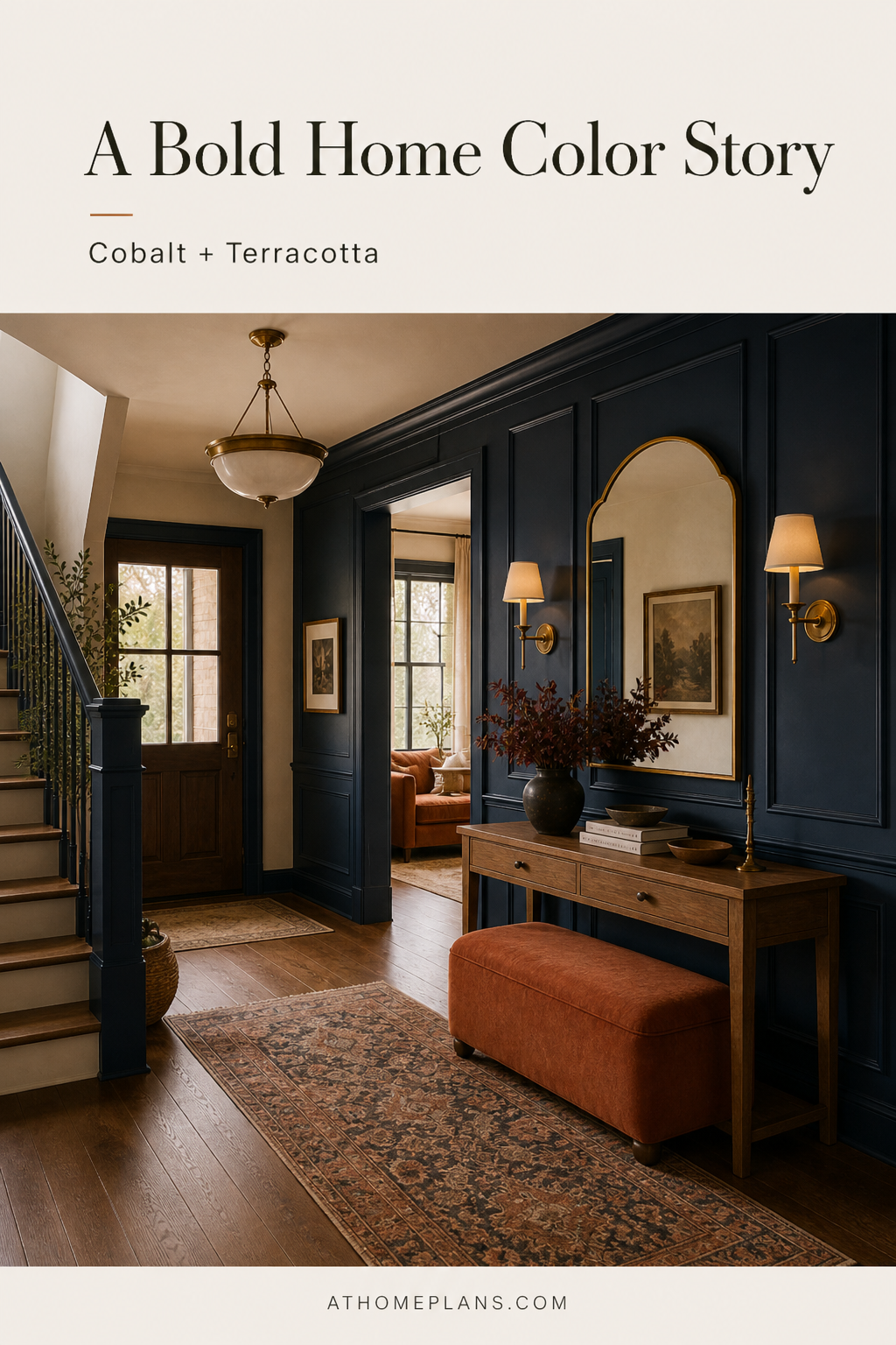
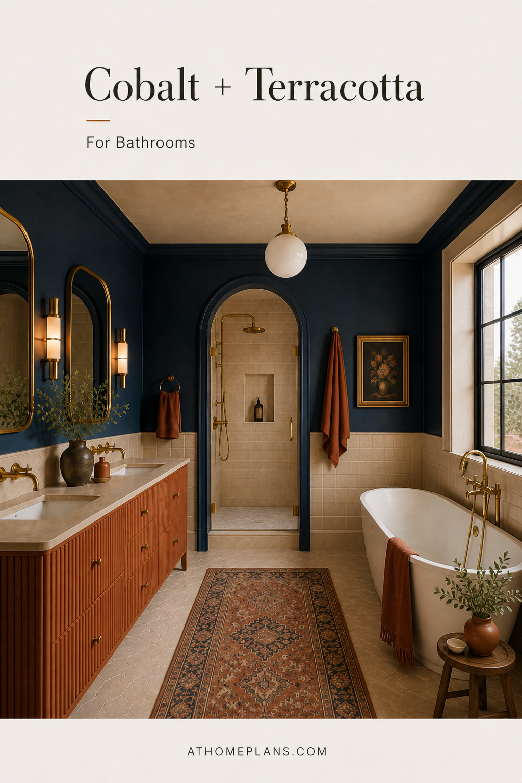
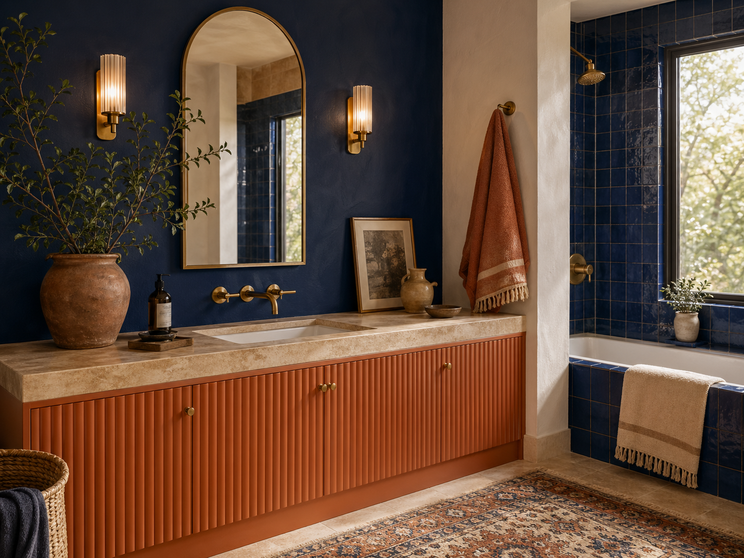
The Cobalt Color Story (Naval SW 6244 + Cavern Clay SW 7701) — The navy and burnt clay combination is the most high-contrast palette in this series, and it works because both colors are equally committed. Naval reads deep and rich rather than cold; Cavern Clay grounds it with warmth. Sconce Gold SW 6398 hardware ties them together. The result works across every room type — kitchen, bathroom, entry, living room — same two colors, same logic, completely different atmospheres.
The common thread across all five: no muddy mid-tones. Every palette uses either a deliberate neutral (Natural Linen SW 9109, Creamy SW 7012) or a fully saturated color — never the uncertain territory in between. That's the real secret to rooms that photograph well and feel confident to live in.
Our Curated Palette Picks
Here are all five color stories — each paired with a real Sherwin-Williams palette you can bring to any paint counter.
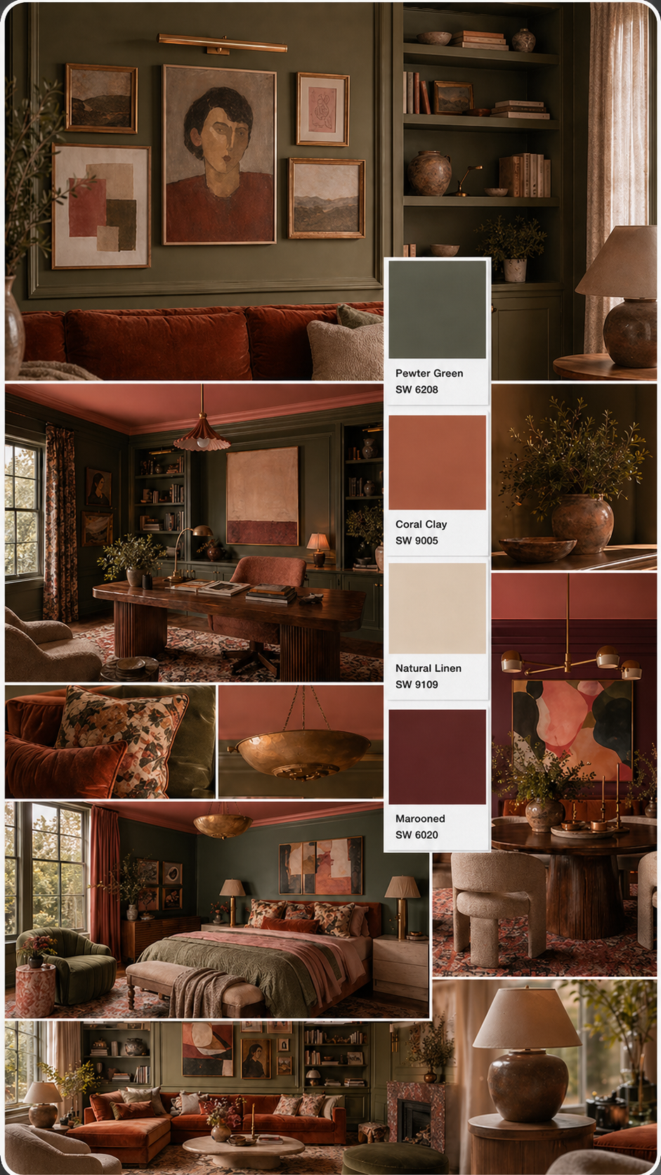
1. The Organic Modern Living Room
A warm, enveloping palette built around deep foliage green with dusty terracotta accents. The green carries the walls; natural linen does the heavy lifting for upholstery; coral clay and marooned come in through pillows and framed art.
| Role | Color | SW Code |
|---|---|---|
| Walls (dominant) | Pewter Green | SW 6208 |
| Trim & upholstery (secondary) | Natural Linen | SW 9109 |
| Accent | Coral Clay | SW 9005 |
Shop this look:
- IKEA BILLY Bookcase — stack 2–3 for floor-to-ceiling coverage, ~$79 each
- West Elm Shelter Track-Arm Sofa in Natural Linen — ~$1,399–$1,799
- IKEA RIBBA Frame (mix black + white for gallery wall) — ~$7–$13 each
2. The Restful Bedroom
The same Pewter Green family, used at lower energy. Marooned on deep accents prevents the palette from feeling spa-generic. Natural Linen on sheets and trim keeps everything light enough to sleep in.
| Role | Color | SW Code |
|---|---|---|
| Walls (dominant) | Pewter Green | SW 6208 |
| Trim & linen (secondary) | Natural Linen | SW 9109 |
| Deep accent | Marooned | SW 6320 |
| Warm accent | Coral Clay | SW 9005 |
Shop this look:
3. The Bold Dining Room
A fully committed jewel-tone palette for a room that's meant to feel special. Rich Marooned on the walls with Coral Clay accents and crisp Natural Linen trim to prevent the palette from going dark.
| Role | Color | SW Code |
|---|---|---|
| Walls (dominant) | Marooned | SW 6320 |
| Accent | Coral Clay | SW 9005 |
| Trim (secondary) | Natural Linen | SW 9109 |
Shop this look:
4. The Focused Office
A muted sage palette designed for concentration. Quiet enough to disappear when you're in flow, distinctive enough to make the room feel intentional. Marooned grounds it when you need an accent that won't distract.
| Role | Color | SW Code |
|---|---|---|
| Walls (dominant) | Pewter Green | SW 6208 |
| Secondary | Natural Linen | SW 9109 |
| Grounding accent | Marooned | SW 6320 |
Shop this look:
- IKEA ALEX Desk (White, 59") — ~$229–$299
- Target Threshold × Studio McGee Dowel Writing Desk — ~$199–$350
- IKEA KALLAX Shelf Unit 2×4 (White) — ~$109–$149
5. The Cobalt Color Story
Color drenching at its most committed. Naval takes every wall and ceiling surface; Cavern Clay answers at cabinetry, island counters, or vanity fronts. Creamy stone and Sconce Gold hardware sit between them as arbiters, stopping the contrast from becoming a fight. The palette works across rooms — kitchen, bathroom, entry, living room — because the logic is the same in each: two powerful colors, held apart by neutrals, given equal authority.
| Role | Color | SW Code |
|---|---|---|
| Walls & ceiling (dominant) | Naval | SW 6244 |
| Cabinetry / accent surfaces | Cavern Clay | SW 7701 |
| Trim & stone (secondary) | Creamy | SW 7012 |
| Hardware finish | Sconce Gold | SW 6398 |
Shop this look:
- Sherwin-Williams Color To Go Sample — Naval SW 6244 — test your dominant wall color first
- Wayfair Birch Lane Cayman Upholstered Dining Chair (clay/terracotta) — bring the Cavern Clay accent into dining/kitchen seating, ~$109–$169
- Amazon Stone & Beam Bowen Industrial Pendant (dark bronze) — coordinates with Sconce Gold hardware in high-contrast kitchens, ~$75–$120
Common Mistakes to Avoid
Choosing paint before your furniture. Paint is the most reversible element in a room. Choose your sofa, flooring, and fixed finishes first, then find a paint color that works with them.
Matching, not coordinating. Trying to exactly match your curtains or sofa to your wall color looks flat and forced. Instead, look for colors that share an undertone — they'll feel cohesive without looking like a uniform.
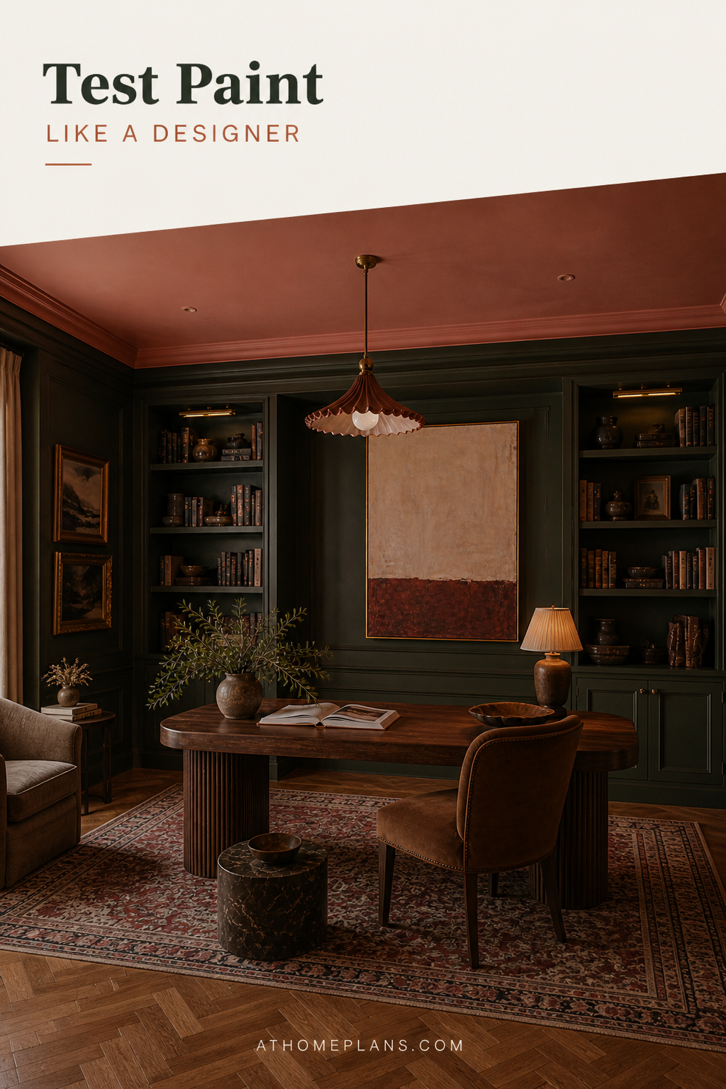
Ignoring the ceiling. Ceilings aren't automatically white. A ceiling painted in a slightly lighter version of your wall color can make a room feel taller and more considered. Conversely, a deeply colored ceiling (what designers call a "fifth wall") creates an enveloping, cozy atmosphere.
Buying cheap paint for expensive rooms. Budget paints often require an extra coat and have lower pigment depth, meaning the color looks flat and fades faster. In high-traffic areas especially, mid-range and premium paints — Behr (great value at Home Depot), PPG, Benjamin Moore, Sherwin-Williams — pay for themselves in coverage and durability.
Deciding in the store. Lighting in paint stores is almost always artificial and flat. Never make a final decision under store lighting — always take a sample home.
Shop the Look
Everything you need to test, choose, and apply paint colors with confidence.
Paint Samples
- Sherwin-Williams Color To Go Sample Pots — available online and in-store
- Benjamin Moore Color Samples — peel-and-stick and sample pot options
- Behr Premium Plus Sample Pots — available at Home Depot
Tools
- Wooster 5-Piece Pro Roller Tray Set — 9" frame, cover, tray, and liner at Home Depot, ~$22–$25
- Purdy Power Lock Pro Extension Pole 4–8 ft — Amazon, ~$20–$28
- Trimaco Stay Put Canvas Plus Drop Cloth (9×12 ft) — Home Depot, ~$28–$35
- Sherwin-Williams Complete Color Fan Deck — 1,500+ colors, Amazon, ~$35–$50
Room Accents
Ready to Start?
Choosing paint colors well comes down to three things: understanding undertones, using the 60-30-10 ratio to create balance, and always — always — testing properly before you commit to a gallon.
Start with your fixed finishes, pick up sample pots from Sherwin-Williams, Benjamin Moore, or Behr at Home Depot, and live with your swatches for 48 hours. The extra time costs nothing. A room you love to live in costs everything.
Looking for more interior advice? Browse our guides to choosing the right paint finish and how to create a cohesive color scheme throughout your home.