Color is the most powerful tool in interior design — and the most intimidating. Walk into a paint store and you're staring at thousands of options. Browse online and you see rooms with seemingly effortless color combinations you can't quite reverse-engineer. Meanwhile, your current walls are still builder beige.
The good news: choosing a color scheme doesn't require a trained eye or years of experience. It requires a system. Here's the one that works.
Why Color Feels So Hard (And Why It Isn't)
Color decisions feel high-stakes because paint is permanent (or feels that way) and mistakes are visible from across the room. But most color confusion comes from trying to choose colors in isolation — picking a wall color before knowing what the sofa, rug, or wood tones in the room will look like.
Color only works in context. The right system starts with what's already fixed and builds outward from there.
Step 1: Start With What You Can't Change
Before choosing any colors, identify the fixed elements in your room — things that are staying regardless of what you paint or buy:
- Flooring (hardwood tone, carpet color, tile)
- Large furniture you're keeping (sofa, bed, dining table)
- Architectural elements (brick fireplace, wood beams, kitchen cabinets)
- Natural light (north-facing rooms get cool light; south-facing get warm)
These fixed elements define your starting palette. Your chosen colors need to work with these, not fight them.
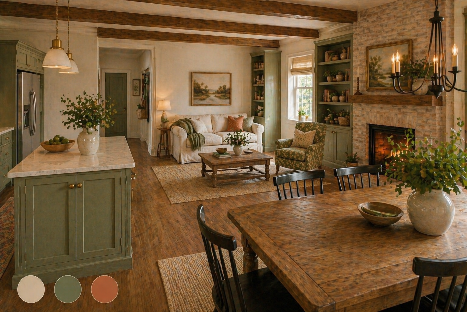
Step 2: Understand the 60-30-10 Rule
This is the foundation of almost every professional color scheme. It distributes color in three proportions:
- 60% — Dominant color (walls, large rugs, main upholstery)
- 30% — Secondary color (secondary furniture, curtains, bedding)
- 10% — Accent color (throw pillows, art, decorative objects)
The dominant color sets the room's overall mood. The secondary color adds interest and depth. The accent color provides punctuation — it draws the eye and keeps the room from feeling flat.
Example: A living room with warm grey walls (60%), navy sofa and curtains (30%), and brass/gold accents in lamps and frames (10%). Cohesive, layered, intentional.
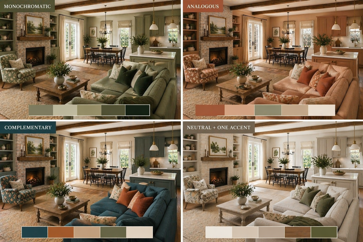
Step 3: Choose Your Palette Type
Not all color schemes are built the same way. Choose one of these proven approaches based on the mood you want:
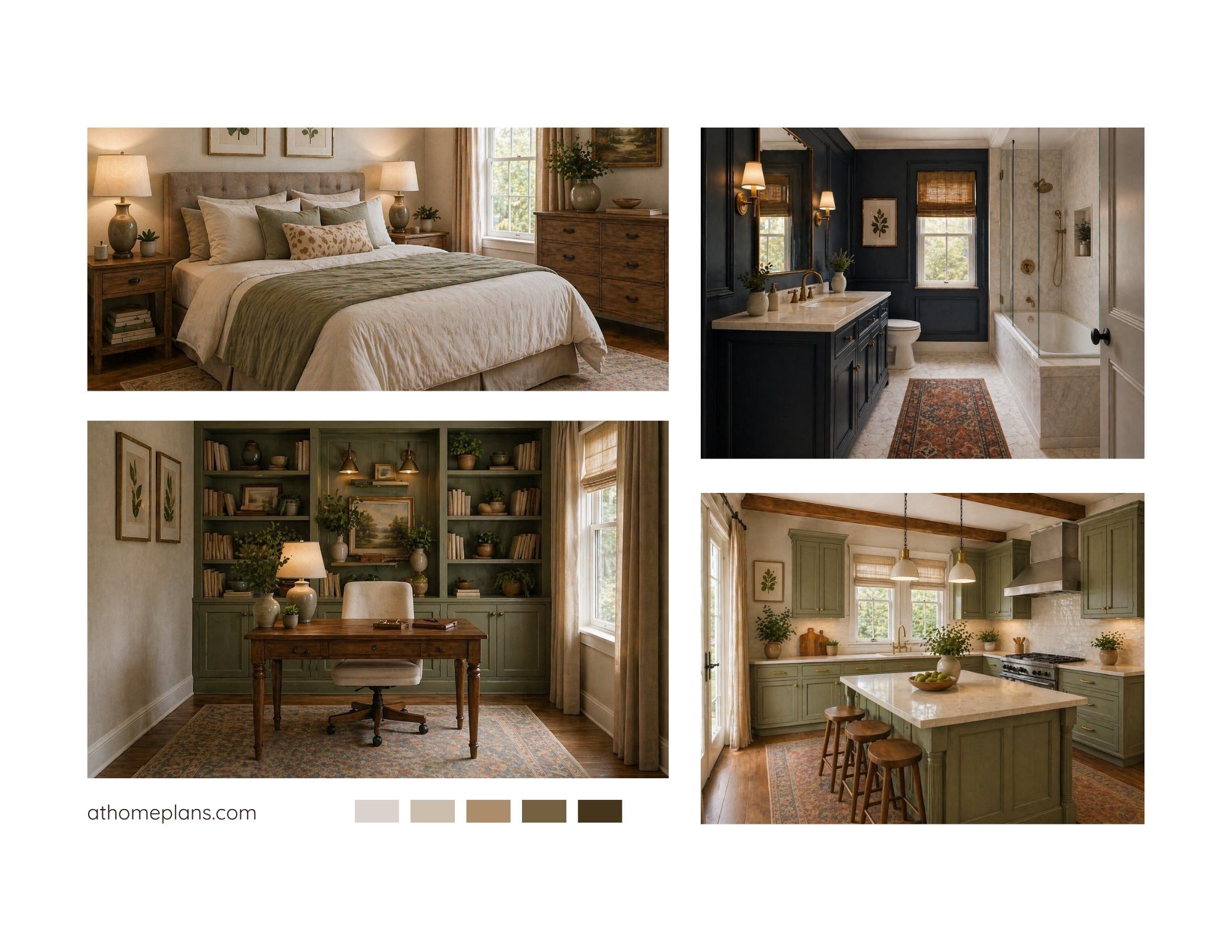
Monochromatic
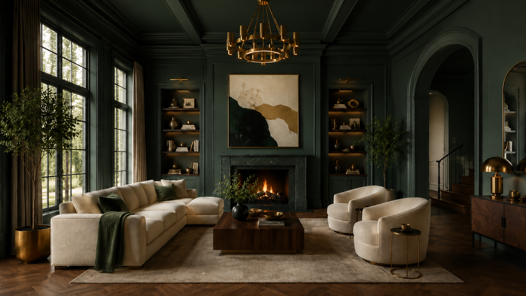
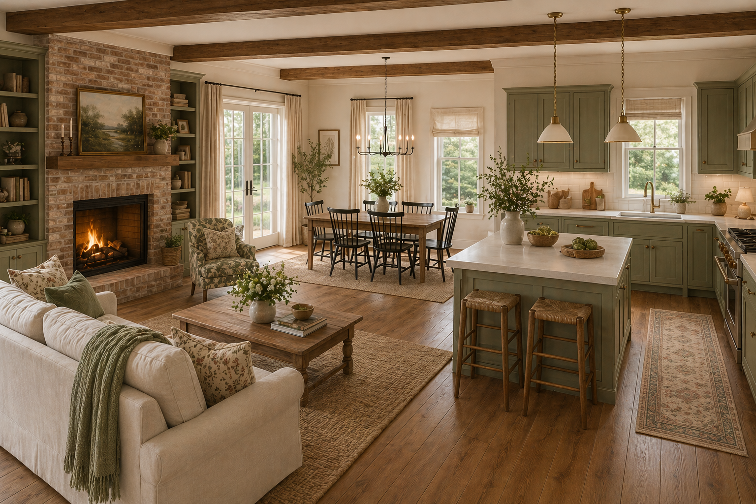
What it is: Multiple shades and tones of one color. Mood: Calm, sophisticated, cohesive. Best for: Bedrooms, bathrooms, minimalist spaces. Example: Soft sage walls, medium olive sofa, dark forest green velvet cushions, cream linen accents.
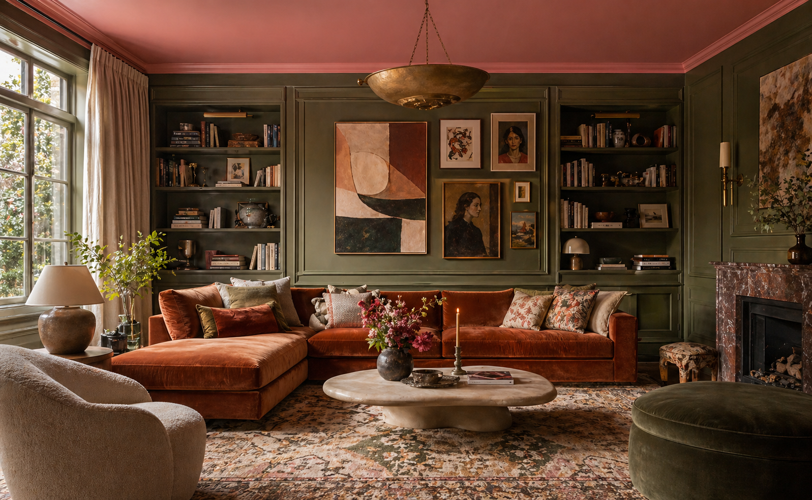
Analogous
What it is: Colors that sit next to each other on the color wheel (e.g., blue + blue-green + green). Mood: Harmonious, restful, natural. Best for: Living rooms, open plan spaces. Example: Warm terracotta walls, peach upholstery, rust accents, cream and sand neutrals throughout.
Complementary
What it is: Colors opposite each other on the color wheel (e.g., blue + orange, green + red). Mood: Dynamic, energetic, visually interesting. Best for: Living rooms, dining rooms, accent walls. Example: Deep teal sofa, warm amber/caramel accents, cream walls to balance the contrast.
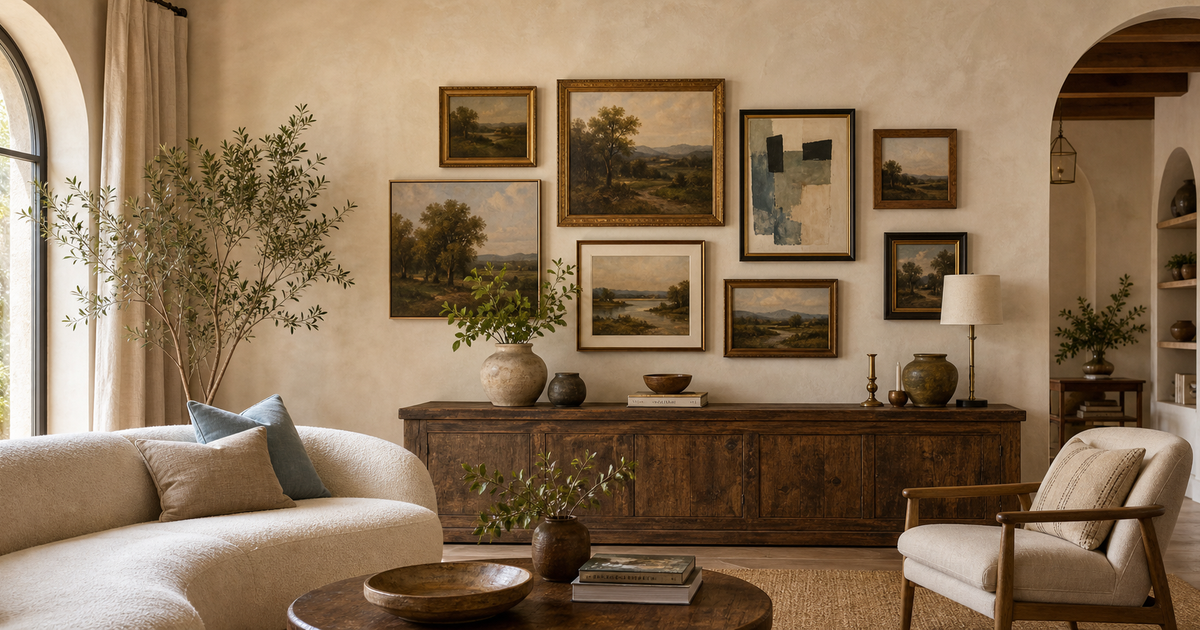
Neutral + One Accent
What it is: An all-neutral base (whites, greys, taupes, warm beiges) with one color used as a deliberate accent. Mood: Clean, versatile, modern. Best for: Any room; highly recommended for anyone unsure where to start. Example: White walls, grey sofa, natural wood floors, olive green as the sole accent color in plants, cushions, and one piece of art.
Step 4: Account for Undertones
This is where most DIY color choices go wrong. Every paint color has an undertone — a secondary hue that influences how it reads in your specific light.
- A "white" with pink undertones will look lavender next to cool grey flooring
- A "greige" (grey-beige) with green undertones will look different than one with purple undertones
- "Light grey" can read blue, purple, or green depending on undertone and light source
How to identify undertones: Hold paint chips against a pure white piece of paper. The undertone becomes apparent in comparison.
Always test paint in your actual room before committing. Get sample pots and paint at least a 12×12 inch patch on the wall — live with it for 48 hours in both daylight and artificial light before deciding.
Room-by-Room Color Guide
Living Room
Living rooms are social spaces — they benefit from colors that feel welcoming without being stimulating. Works well: Warm neutrals (warm white, greige, soft terracotta), deep rich colors (navy, forest green, warm charcoal) for drama. Avoid: Very bright or saturated colors, which feel tiring over time.
Bedroom
The bedroom should promote rest — choose colors that lower the heart rate. Works well: Soft blues, muted greens, warm neutrals, dusty rose, soft lavender. Avoid: Bright reds, electric blues, or highly saturated colors. They're stimulating.
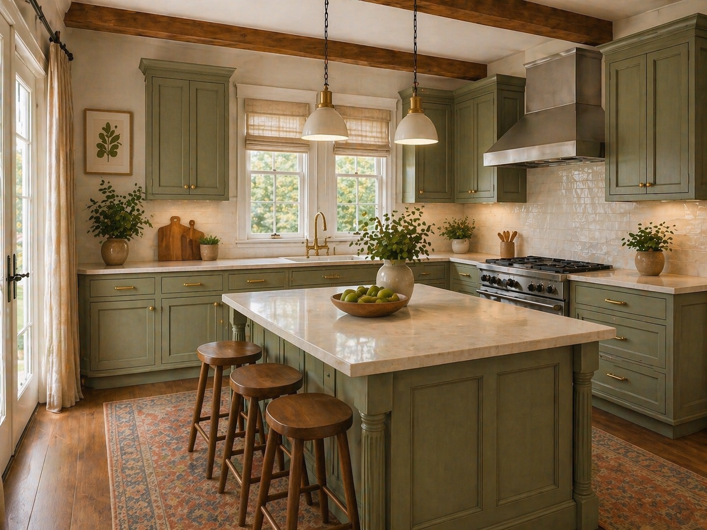
Kitchen
Kitchens tolerate bolder choices — the fixtures and appliances provide visual grounding. Works well: Warm whites, soft sage or olive green, warm navy on lower cabinets, natural wood tones. Avoid: Very trendy colors that date quickly — kitchens are expensive to repaint.
Bathroom
Small spaces can handle more color than large rooms — the limited surface area makes bold choices feel contained rather than overwhelming. Works well: Deep navy, forest green, warm terracotta, black and white classics. Avoid: Colors that compete with skin tones under artificial light (avoid cool greens and harsh yellows).
Home Office
The office needs to support focus without inducing fatigue. Works well: Warm whites, soft sage, slate blue, warm beige. Avoid: Pure white (too clinical over long periods) and very dark colors (can feel oppressive in a small work space).
How to Test Your Scheme Before Committing
Before buying a full gallon of anything:
- Order sample pots and paint large swatches on the actual wall
- Check samples at different times of day — morning, afternoon, and evening artificial light
- Hold paint samples next to your fixed elements (flooring, sofa, cabinets)
- Look at the sample on multiple walls — colors shift based on which direction a wall faces
If you're unsure between two colors, go with the one that works in the worst light condition (usually evening overhead light). A color that looks good at night looks great in daylight.
Bring It All Together With a Room Plan
Color choices don't live in isolation — they need to be seen alongside the furniture, materials, and proportions of an actual room. A mood board that brings together your color palette, furniture selections, and material finishes is the clearest way to see whether everything works before you commit. A professionally designed room plan from athomeplans.com gives you exactly that: a complete visual reference where color guidance, furniture arrangement, and material selections come together in one place.
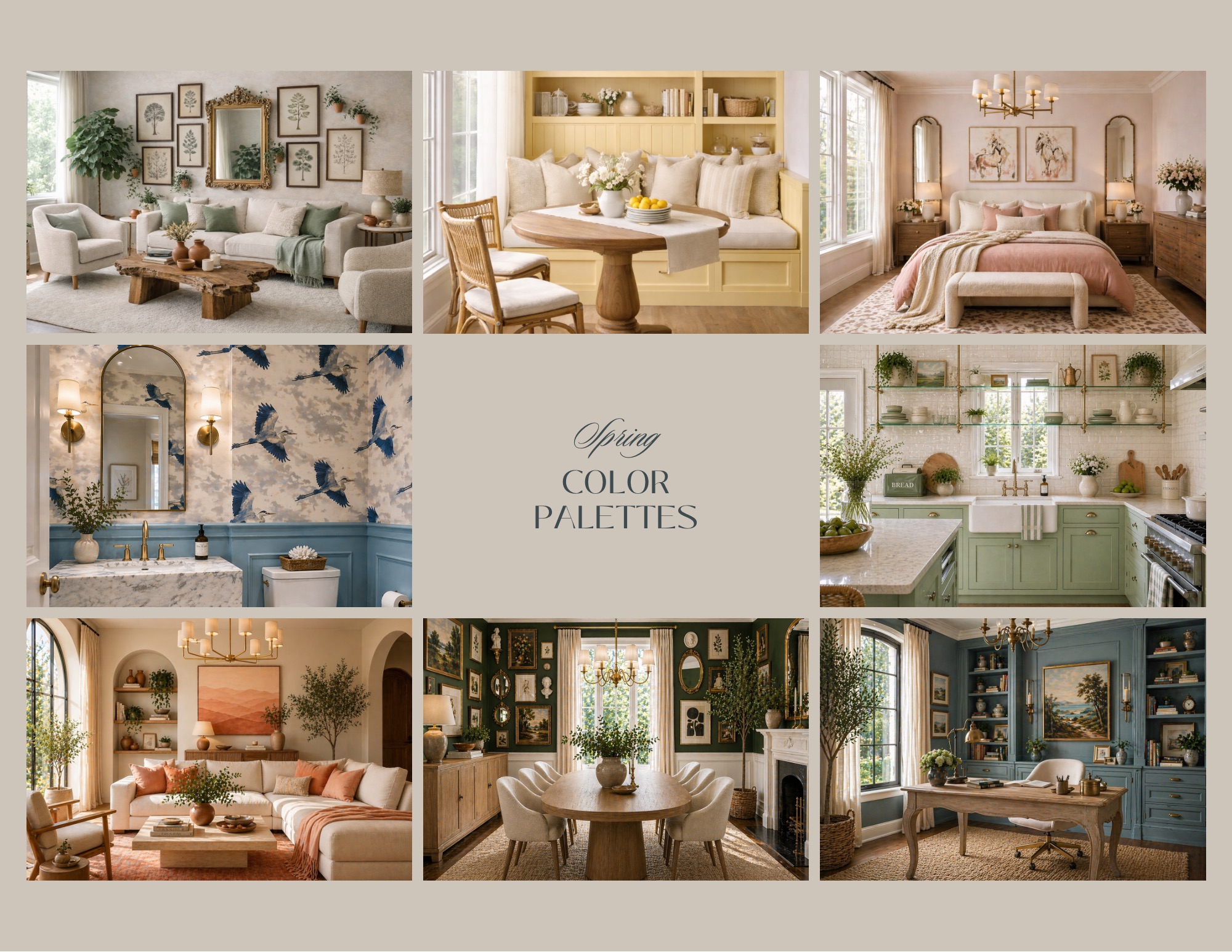
Looking for seasonal inspiration? See our Spring Color Palettes for Your Home for ten ready-to-use combinations that work across every room.
Design your home with confidence. Explore room plans and interior design solutions at athomeplans.com.