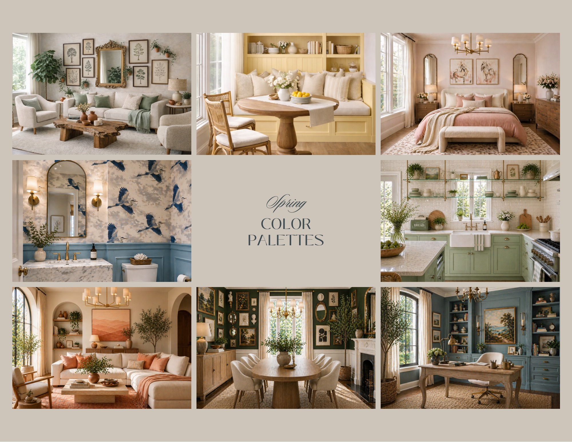
Spring is nature's reset button — the season when everything blooms, brightens, and breathes again. Your home deserves the same refresh. Whether you're repainting an accent wall, swapping throw pillows, or planning a full room overhaul, the right spring color palette can make your space feel instantly alive and inviting.
We've curated 10 spring-inspired palettes that work across every style — from minimalist Scandinavian to cozy cottagecore — so you can find the one that speaks to your vision.
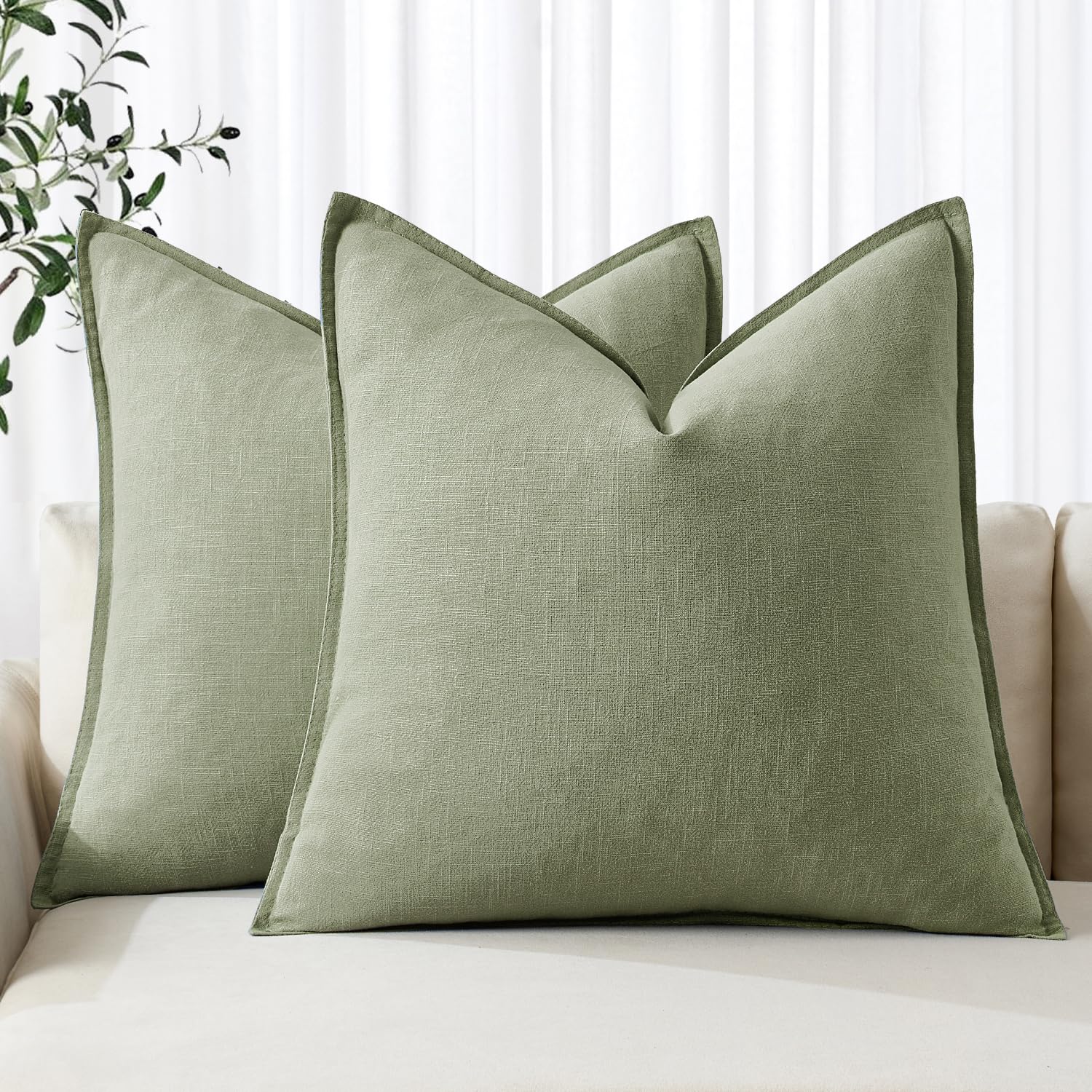
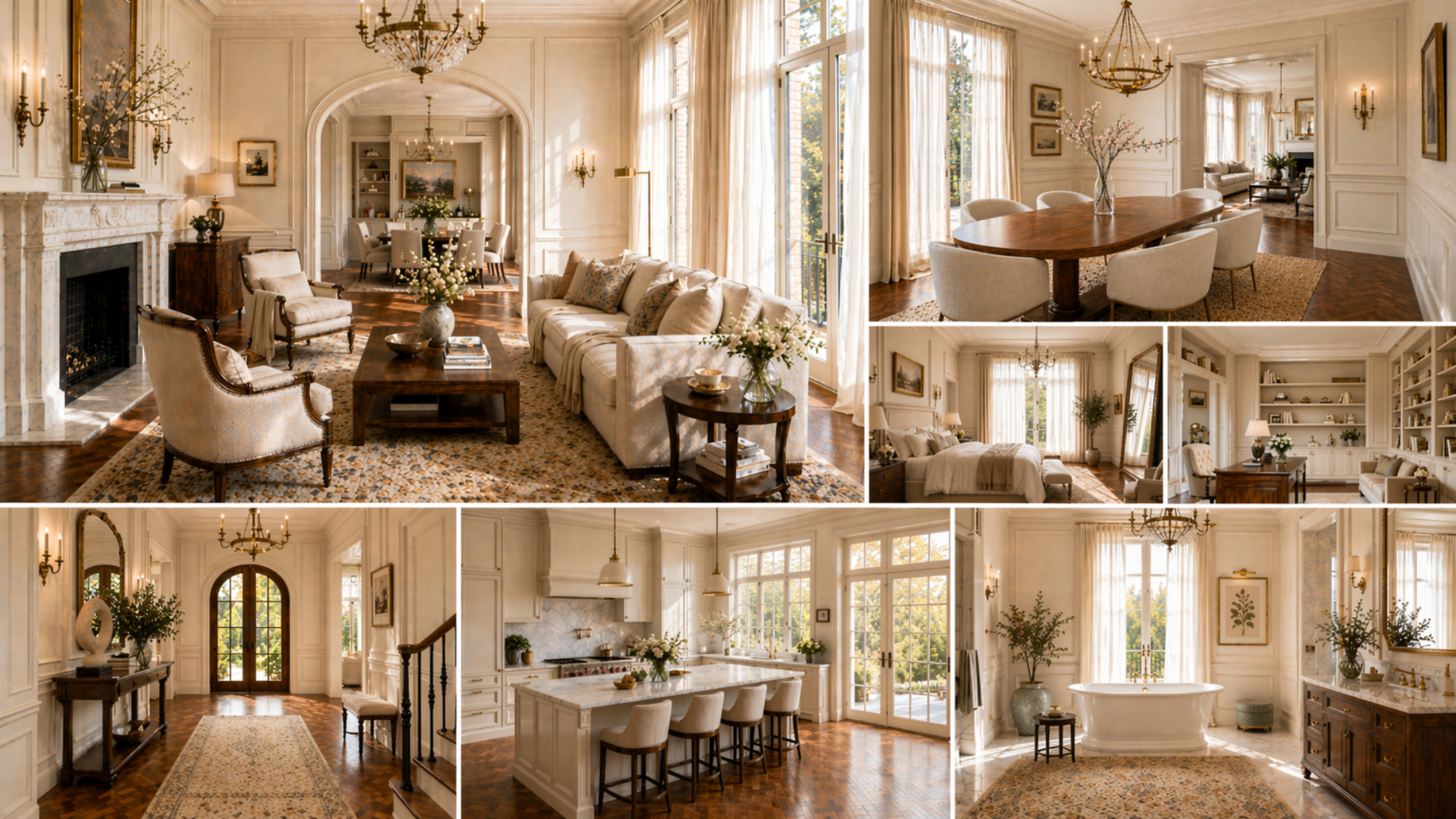
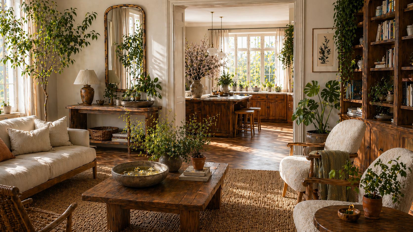
1. Soft Sage & Warm Cream
The vibe: Earthy, calming, effortlessly organic
There's a reason sage green has dominated interior design for the past few seasons — it's the color equivalent of a deep breath. Pair it with warm cream walls and natural linen textures for a living room that feels like a sun-drenched greenhouse.
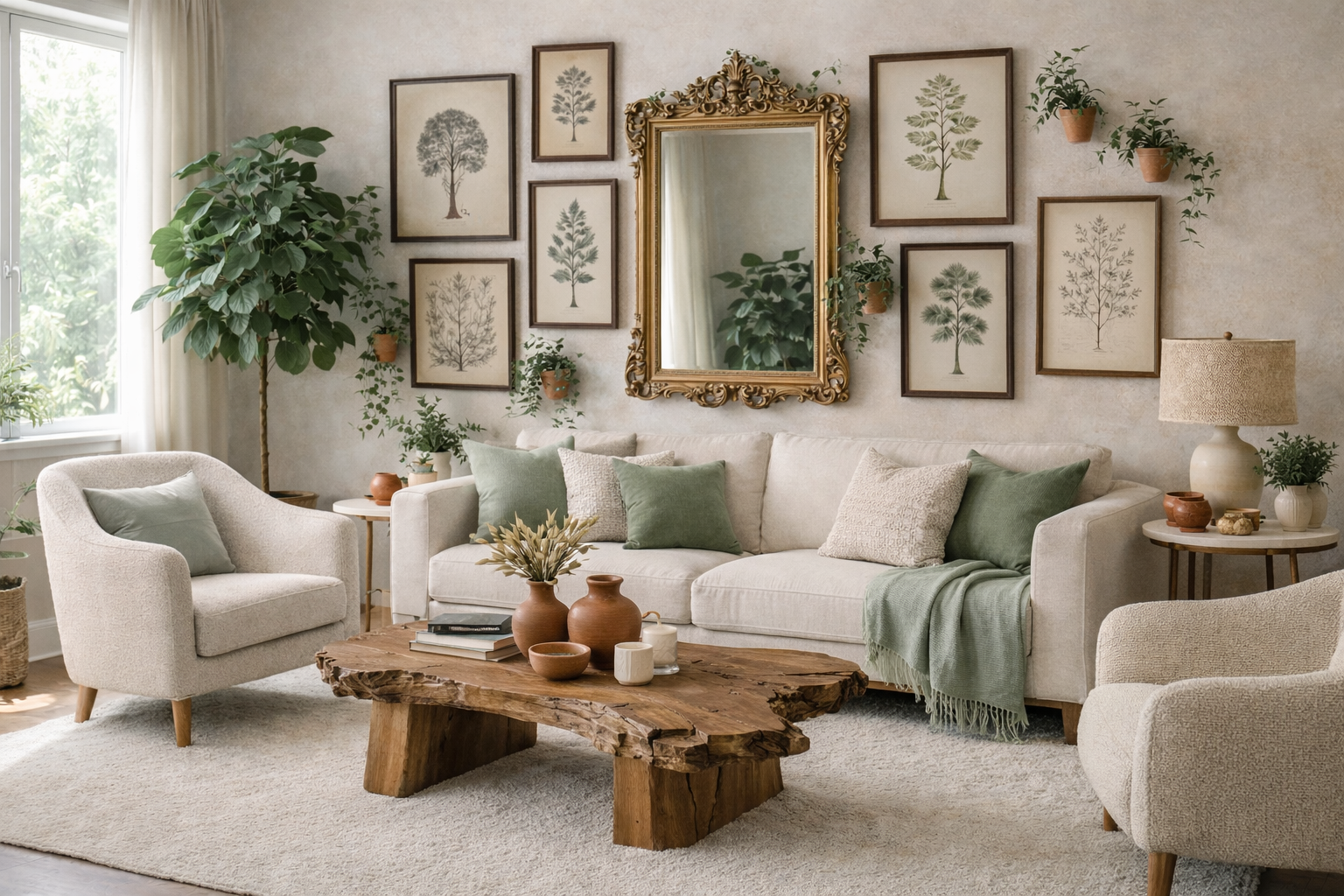
- Primary: Sage green (#8A9A7A)
- Secondary: Warm cream (#F5EDD9)
- Accent: Terracotta (#C77B5B)
- Best for: Living rooms, bedrooms, home offices
Pro tip: Layer sage green through plants, throw pillows, and a statement armchair — no paint required.
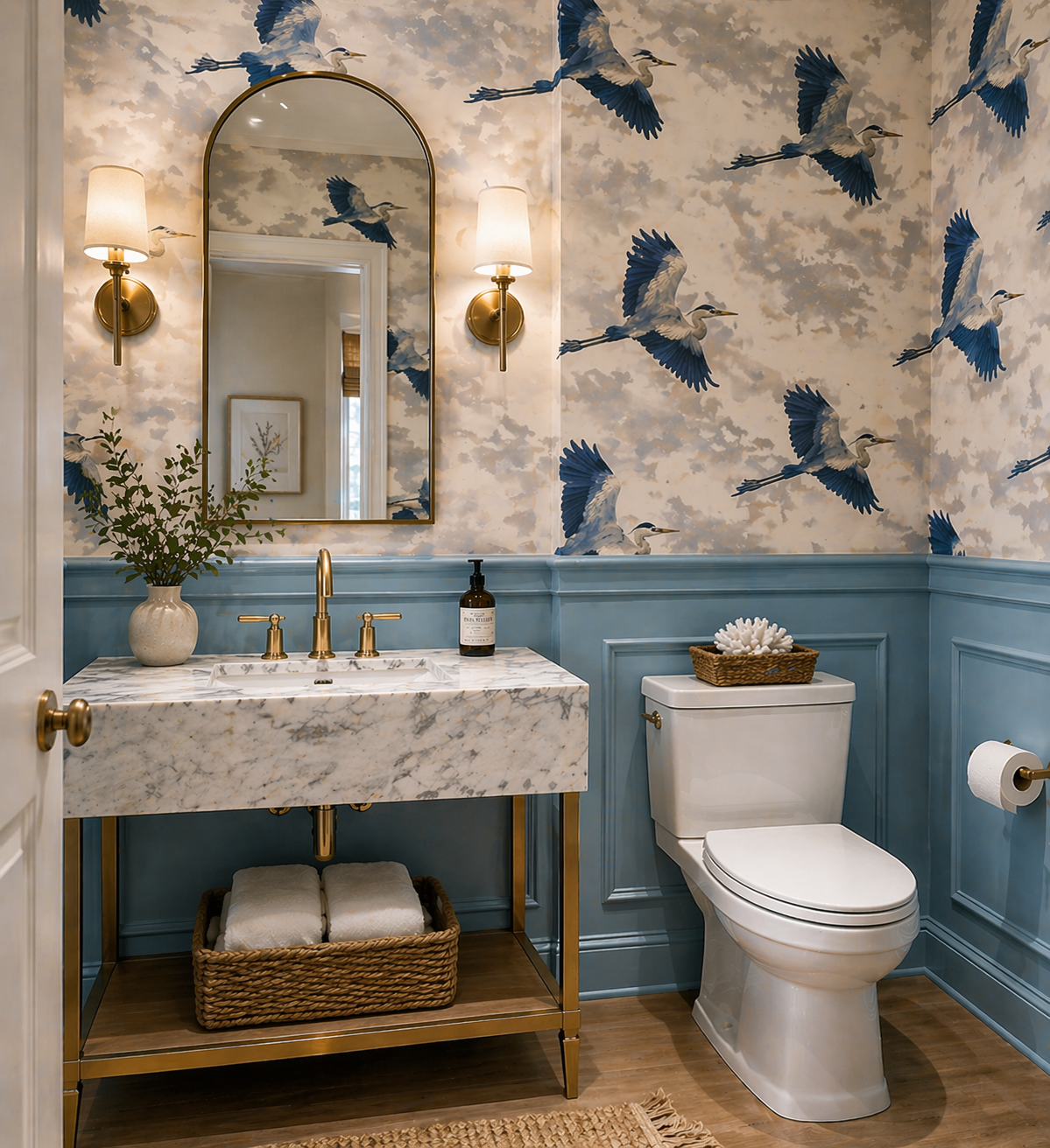
2. Lavender Mist & Soft White
The vibe: Dreamy, romantic, spa-like serenity
Lavender has made a major comeback, and it's not just for bedrooms anymore. When softened with pure whites and pale grays, this palette creates an airy, cloud-like atmosphere perfect for bathrooms and reading nooks.
- Primary: Soft lavender (#C5BAE0)
- Secondary: Cloud white (#F8F7F4)
- Accent: Dusty rose (#D4A5A5)
- Best for: Bathrooms, bedrooms, nurseries
Pro tip: Keep furniture light and minimal — heavy wood tones can weigh down this ethereal palette.
3. Buttercup Yellow & Crisp Linen
The vibe: Cheerful, energizing, sunshine-forward
If winter left your home feeling gray and heavy, this is your antidote. Buttercup yellow brings joy to kitchens and breakfast nooks without feeling overwhelming when balanced with crisp linen and natural wood.
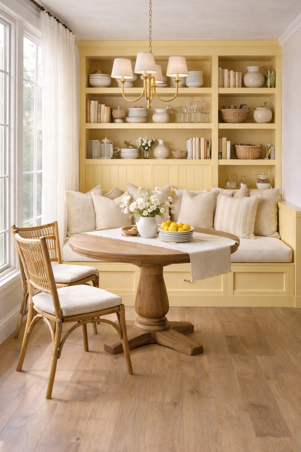
- Primary: Buttercup yellow (#F2CB5C)
- Secondary: Linen white (#FAF3E8)
- Accent: Warm walnut (wood tones)
- Best for: Kitchens, dining rooms, sunrooms
Pro tip: Use yellow in smaller doses — cabinet hardware, bar stools, or a single pendant light — for maximum impact with minimum risk.
4. Blush Pink & Warm Ivory
The vibe: Soft, sophisticated, timeless femininity
Blush pink has evolved far beyond millennial pink. Today's version is deeper, warmer, and decidedly grown-up. Paired with warm ivory and gold accents, it delivers understated elegance that works beautifully in primary bedrooms and formal living spaces.
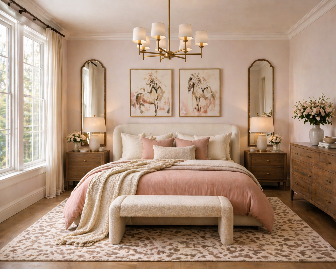
- Primary: Dusty blush (#E8B4B8)
- Secondary: Warm ivory (#FFF8F0)
- Accent: Antique gold (#C9A96E)
- Best for: Bedrooms, living rooms, entryways
Pro tip: Ground the palette with a dark velvet sofa or charcoal rug to prevent it from reading as too sweet.
5. Sky Blue & Fresh White
The vibe: Coastal, breezy, open-sky optimism
Nothing says spring like a clear blue sky. This classic combination evokes coastal cottages and Mediterranean villas — spaces that feel perpetually light, breezy, and vacation-ready.
- Primary: Sky blue (#7EB8D4)
- Secondary: Crisp white (#FAFAFA)
- Accent: Sandy beige (#D4C4A8)
- Best for: Bathrooms, kitchens, coastal living rooms
Pro tip: Mix in natural textures like wicker, jute, and driftwood to keep the palette grounded and layered.
6. Mint Green & Natural White
The vibe: Fresh, retro-modern, playfully cool
Mint green sits at the intersection of nostalgic and contemporary. It's fresh without being aggressive, and brings a retro charm to kitchens and powder rooms when paired with matte white and brushed nickel fixtures.
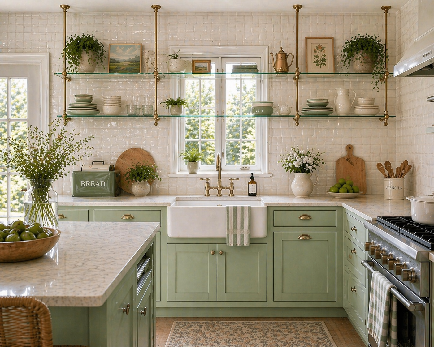
- Primary: Mint green (#A8D5C2)
- Secondary: Natural white (#F2F0EB)
- Accent: Pale brass (#D4B896)
- Best for: Kitchens, bathrooms, playrooms
Pro tip: Mint cabinets with white countertops is a bold but beautiful kitchen move — pair with open shelving to keep it feeling airy.
7. Peach & Terracotta Ombre
The vibe: Sun-warmed, boho, richly textured
Think golden hour at the end of a perfect spring day. This warm, earthy palette layers peach, apricot, and terracotta to create depth and coziness without losing that spring brightness. It pairs beautifully with rattan, macramé, and woven textiles.
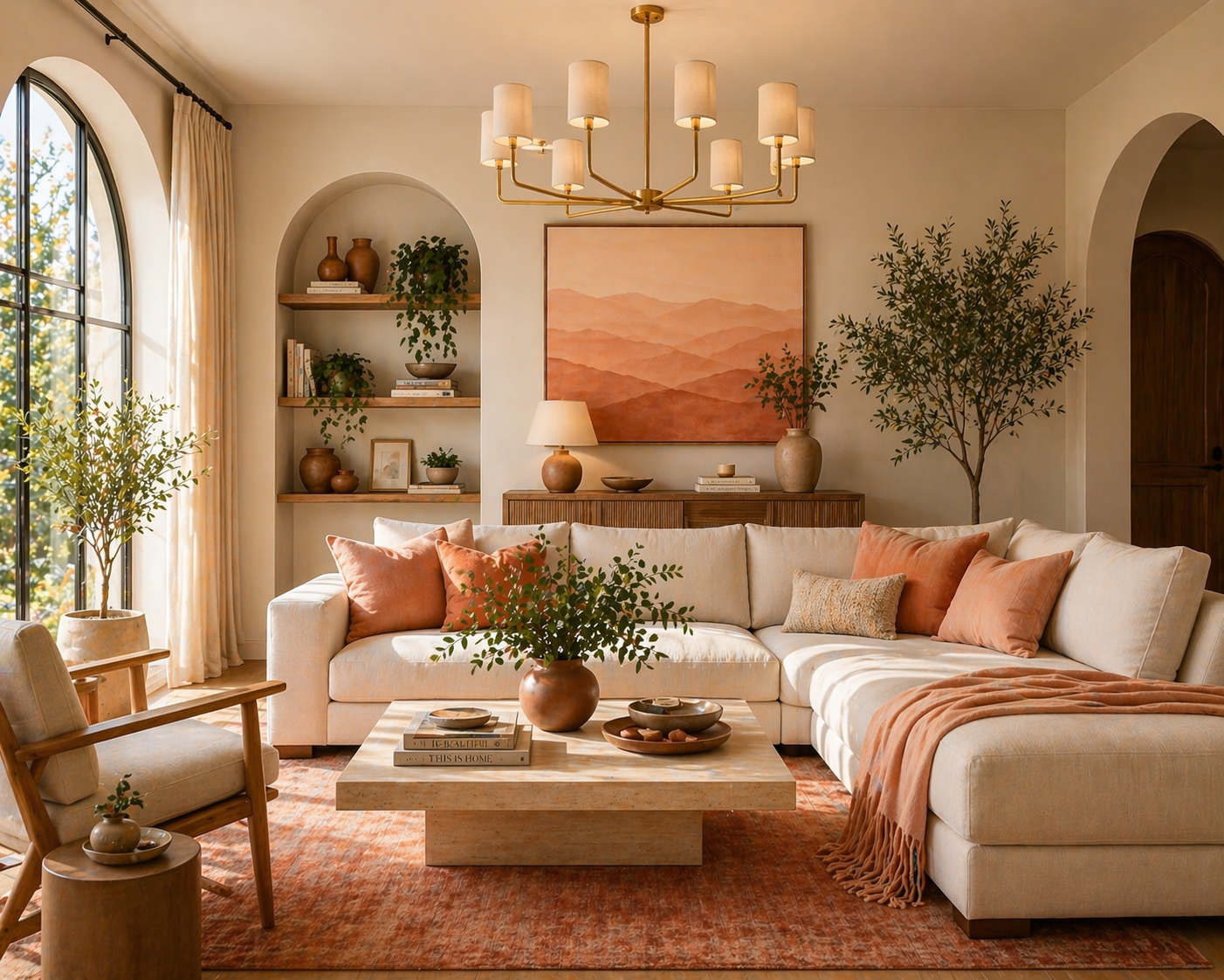
- Primary: Soft peach (#F4B7A0)
- Secondary: Apricot (#F2A26E)
- Accent: Deep terracotta (#C06040)
- Best for: Bohemian living rooms, bedrooms, dining rooms
Pro tip: Layer the ombre effect through textiles — a peach throw, apricot pillows, and a terracotta rug create the gradient without painting.
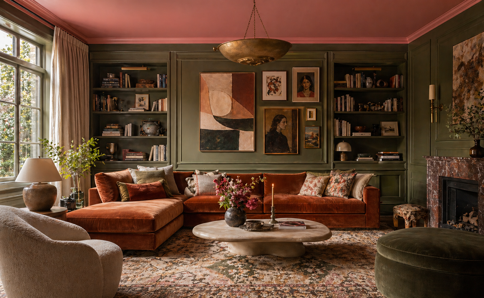
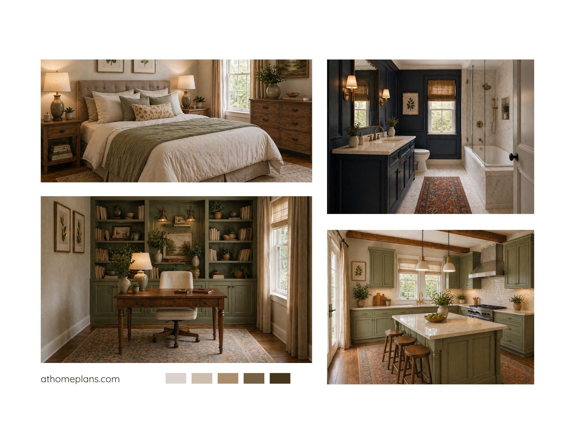
8. Forest Green & Cream
The vibe: Sophisticated, botanical, library-chic
For those who find pastels too soft, forest green brings that same connection to nature with more drama. This rich, jewel-toned green paired with cream and warm wood feels like a sophisticated English country house — timeless rather than trendy.
- Primary: Forest green (#3D6B4F)
- Secondary: Antique cream (#F5EDD0)
- Accent: Cognac leather (warm brown tones)
- Best for: Studies, dining rooms, moody living rooms
Pro tip: Dark green walls with white trim and gold accents is one of the most elegant combinations in interior design — commit to it fully.
9. Dusty Teal & Warm Sand
The vibe: Serene, coastal-luxe, timeless elegance
Dusty teal is the color of still ocean water — calming, grounding, and quietly stunning. Paired with warm sand tones and natural textures, this palette brings a sophisticated coastal retreat feel to any room without veering into kitschy beach-house territory.
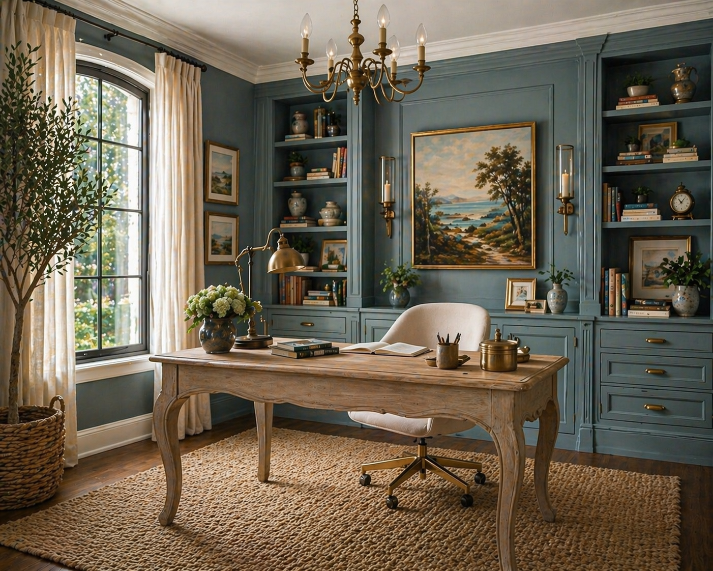
- Primary: Dusty teal (#5F8FA0)
- Secondary: Warm sand (#E8D9C0)
- Accent: Burnished bronze (#A07B5A)
- Best for: Living rooms, master bedrooms, entryways, home offices
Pro tip: Teal walls with sand-toned linen and bronze fixtures create instant depth — add a woven jute rug to tie the warmth all the way to the floor.
10. Coral & Warm White
The vibe: Bold, vibrant, unapologetically joyful
Coral is spring's most confident color — warm, energetic, and instantly cheerful. It's not for everyone, but for those who embrace it, a coral accent wall or set of vibrant kitchen chairs can become the defining feature of a space that never fails to make guests smile.
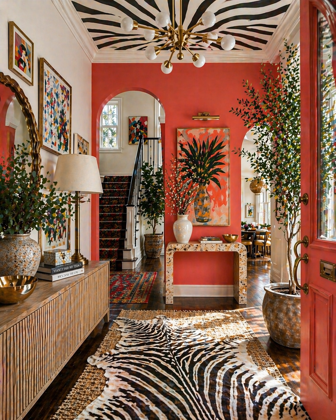
- Primary: Living coral (#FF6B6B)
- Secondary: Warm white (#FFF5EE)
- Accent: Golden yellow (#FFD166)
- Best for: Kitchens, entryways, accent walls
Pro tip: If full coral walls feel like too much, start with a single coral piece — a statement sofa, a painted dresser, or a cluster of coral vases.
How to Choose Your Spring Palette
With so many options, how do you know which palette is right for your home?
Start with the light. The way natural light enters your space will transform any color. Cool north-facing rooms benefit from warm palettes (peach, cream, butter yellow). South-facing rooms can handle cooler, more dramatic shades.
Consider your existing pieces. If your sofa or rug is not changing, your palette needs to complement what you already have. Pick up a secondary or accent color from a piece you love.
Think in layers. You do not need to repaint to refresh a room. Swap textiles, add a few plants, and replace throw pillows — you can cycle through spring colors seasonally without major commitment.
Test before committing. Always sample paint colors on the actual wall before purchasing full cans. Colors look dramatically different in different lighting conditions and against different surfaces.
Ready to Transform Your Space?
At athomeplans, we believe beautiful interior design should be accessible to everyone — not just those with large renovation budgets. Browse our curated floor plans and design templates to find the layout that will bring your spring refresh to life.
Whether you are redesigning a single room or planning a full home makeover, our digital plans give you the professional framework to execute your vision with confidence.
For the full spring interior look, read Light and Airy Spring Interiors: How to Achieve the Look.
See what else is defining the season in Spring Home Decor Trends 2026: The Looks Defining This Season.
At Home Plans creates accessible, professionally designed interior floor plans and design guides for real homes. Browse our full collection on Etsy.